Blaylock Missions – January 2026 @media (max-width: 1024px) { .typography .pullquote-align-left, .typography.editor .pullquote-align-left, .typography .pullquote-align-right, .typography.editor .pullquote-align-right, .typography .pullquote-align-wide, .typography.editor .pullquote-align-wide, .typography .pullquote-align-center, .typography.editor .pullquote-align-center { float: none; margin: 0 auto; width: 100%; max-width: 100%; } } @media all and (-ms-high-contrast: none), (-ms-high-contrast: active) { .typography .markup table.image-wrapper img, .typography.editor .markup table.image-wrapper img, .typography .markup table.kindle-wrapper img, .typography.editor .markup table.kindle-wrapper img { max-width: 550px; } } @media (min-width: 1024px) { .typography:not(:has(#toc)) .captioned-image-container figure:has(> a.image2-offset-left), .typography.editor:not(:has(#toc)) .captioned-image-container figure:has(> a.image2-offset-left) { margin-left: var(–image-offset-margin); } .typography:not(:has(#toc)) .captioned-image-container figure:has(> a.image2-offset-right), .typography.editor:not(:has(#toc)) .captioned-image-container figure:has(> a.image2-offset-right) { margin-right: var(–image-offset-margin); } } @media (min-width: 1300px) { .typography .captioned-image-container figure:has(> a.image2-offset-left), .typography.editor .captioned-image-container figure:has(> a.image2-offset-left) { margin-left: var(–image-offset-margin); } .typography .captioned-image-container figure:has(> a.image2-offset-right), .typography.editor .captioned-image-container figure:has(> a.image2-offset-right) { margin-right: var(–image-offset-margin); } } @media (max-width: 1024px) { .typography, .typography.editor { } .typography .captioned-image-container figure:has(> a.image2-align-left), .typography.editor .captioned-image-container figure:has(> a.image2-align-left), .typography .captioned-image-container figure:has(> a.image2-align-right), .typography.editor .captioned-image-container figure:has(> a.image2-align-right) { float: none; margin: 1em auto; max-width: 100%; width: auto; padding: 0; } .typography .captioned-image-container figure:has(> a.image2-align-left.thefp), .typography.editor .captioned-image-container figure:has(> a.image2-align-left.thefp), .typography .captioned-image-container figure:has(> a.image2-align-right.thefp), .typography.editor .captioned-image-container figure:has(> a.image2-align-right.thefp) { margin: 1em auto; } .typography .captioned-image-container figure:has(> a.image2-offset-left), .typography.editor .captioned-image-container figure:has(> a.image2-offset-left), .typography .captioned-image-container figure:has(> a.image2-offset-right), .typography.editor .captioned-image-container figure:has(> a.image2-offset-right) { margin: 1em auto; } .typography .captioned-image-container figure:has(> a.image2-align-left) .image2-inset, .typography.editor .captioned-image-container figure:has(> a.image2-align-left) .image2-inset, .typography .captioned-image-container figure:has(> a.image2-align-right) .image2-inset, .typography.editor .captioned-image-container figure:has(> a.image2-align-right) .image2-inset { display: block; justify-content: initial; } } @media (max-width: 768px) { .typography .markup div.sponsorship-campaign-embed, .typography.editor .markup div.sponsorship-campaign-embed { margin-top: 24px; margin-bottom: 24px; } .typography .markup div.sponsorship-campaign-embed:first-child, .typography.editor .markup div.sponsorship-campaign-embed:first-child { margin-top: 0px; } } @media screen and (max-width: 650px) { .typography .markup div.youtube-overlay, .typography.editor .markup div.youtube-overlay, .typography .markup div.vimeo-overlay, .typography.editor .markup div.vimeo-overlay { display: none !important; } } @media screen and (max-width: 370px) { .typography .markup div.tiktok-wrap, .typography.editor .markup div.tiktok-wrap { width: calc(95vw – 32px); height: calc((95vw – 32px – 2px) / 0.485714); } } @media screen and (max-width: 650px) { .typography .markup div.embedded-publication-wrap .embedded-publication.show-subscribe, .typography.editor .markup div.embedded-publication-wrap .embedded-publication.show-subscribe { padding: 24px; } } @media screen and (max-width: 650px) { .typography .markup div.subscription-widget-wrap .subscription-widget.show-subscribe, .typography.editor .markup div.subscription-widget-wrap .subscription-widget.show-subscribe, .typography .markup div.subscription-widget-wrap-editor .subscription-widget.show-subscribe, .typography.editor .markup div.subscription-widget-wrap-editor .subscription-widget.show-subscribe, .typography .markup div.captioned-button-wrap .subscription-widget.show-subscribe, .typography.editor .markup div.captioned-button-wrap .subscription-widget.show-subscribe { padding: 0px 24px; } } @media screen and (max-width: 650px) { .typography .markup div.subscription-widget-wrap .subscription-widget.show-subscribe .subscription-widget-subscribe .button, .typography.editor .markup div.subscription-widget-wrap .subscription-widget.show-subscribe .subscription-widget-subscribe .button, .typography .markup div.subscription-widget-wrap-editor .subscription-widget.show-subscribe .subscription-widget-subscribe .button, .typography.editor .markup div.subscription-widget-wrap-editor .subscription-widget.show-subscribe .subscription-widget-subscribe .button, .typography .markup div.captioned-button-wrap .subscription-widget.show-subscribe .subscription-widget-subscribe .button, .typography.editor .markup div.captioned-button-wrap .subscription-widget.show-subscribe .subscription-widget-subscribe .button { padding: 10px 12px; min-width: 110px; } } @media (max-width: 650px) { .typography .markup .twitter-embed, .typography.editor .markup .twitter-embed, .typography .markup .tweet, .typography.editor .markup .tweet { padding: 12px; } } @media (max-width: 650px) { .typography .markup .twitter-embed .tweet-text, .typography.editor .markup .twitter-embed .tweet-text, .typography .markup .tweet .tweet-text, .typography.editor .markup .tweet .tweet-text { font-size: 14px; line-height: 20px; } } @media (max-width: 650px) { .typography .markup .twitter-embed .tweet-photos-container.two, .typography.editor .markup .twitter-embed .tweet-photos-container.two, .typography .markup .tweet .tweet-photos-container.two, .typography.editor .markup .tweet .tweet-photos-container.two, .typography .markup .twitter-embed .tweet-photos-container.three, .typography.editor .markup .twitter-embed .tweet-photos-container.three, .typography .markup .tweet .tweet-photos-container.three, .typography.editor .markup .tweet .tweet-photos-container.three, .typography .markup .twitter-embed .tweet-photos-container.four, .typography.editor .markup .twitter-embed .tweet-photos-container.four, .typography .markup .tweet .tweet-photos-container.four, .typography.editor .markup .tweet .tweet-photos-container.four { height: 200px; } } @media (max-width: 650px) { .typography .markup .twitter-embed a.expanded-link .expanded-link-img, .typography.editor .markup .twitter-embed a.expanded-link .expanded-link-img, .typography .markup .tweet a.expanded-link .expanded-link-img, .typography.editor .markup .tweet a.expanded-link .expanded-link-img { max-height: 180px; } } @media (max-width: 650px) { .typography .markup .twitter-embed a.expanded-link .expanded-link-description, .typography.editor .markup .twitter-embed a.expanded-link .expanded-link-description, .typography .markup .tweet a.expanded-link .expanded-link-description, .typography.editor .markup .tweet a.expanded-link .expanded-link-description { display: none; } } @media screen and (max-width: 650px) { .typography .markup .apple-podcast-container, .typography.editor .markup .apple-podcast-container { width: unset; } } @media (max-width: 420px) { .typography .markup .install-substack-app-embed img.install-substack-app-embed-img, .typography.editor .markup .install-substack-app-embed img.install-substack-app-embed-img { margin: 0 auto 16px auto; } } @media (max-width: 420px) { .typography .markup .install-substack-app-embed .install-substack-app-embed-text, .typography.editor .markup .install-substack-app-embed .install-substack-app-embed-text { margin: 0 0 12px 0; max-width: 100%; width: auto; text-align: center; } } @media (max-width: 420px) { .typography .markup .install-substack-app-embed .install-substack-app-embed-link, .typography.editor .markup .install-substack-app-embed .install-substack-app-embed-link { display: flex; justify-content: center; } } @media screen and (min-width: 481px) { .share-button-container { height: 38px; } } @media screen and (min-width: 481px) { .share-button-container a.comment { height: 38px; line-height: 38px; padding-right: 10px; } } @media screen and (max-width: 480px) { .share-button-container .separator { display: block; margin: 0; height: 8px; border-left: none; } } @media screen and (max-width: 480px) { .share-button-container a.share.first img { padding-left: 0; } } @media screen and (min-width: 481px) { .share-button-container a.mobile { display: none !important; } } @media screen and (min-width: 541px) { .settings-add-pub-modal-wrapper .container .add-recommending-pub-modal-container { padding: 36px; height: 680px; } } @media screen and (min-width: 541px) { .settings-add-pub-modal-wrapper .container .add-recommending-pub-modal-container .footer { position: absolute; bottom: 36px; margin: 0px; } } @media screen and (max-width: 650px) { .header-anchor-parent { display: none; } } @media screen and (max-width: 768px) { .post { padding: 16px 0 0 0; } } @media screen and (max-width: 650px) { .post .post-header .post-label { margin-top: 8px; } } @media screen and (max-width: 650px) { .post .post-header .meta-author-wrap.alternative-meta .meta-right-column .post-meta { margin-top: 6px; } } @media screen and (max-width: 650px) { .post .footer-facepile-container { height: 64px; padding: 0 16px; display: flex; align-items: center; justify-content: flex-start; width: 100%; } } @media screen and (max-width: 650px) { .post .post-footer.use-separators { justify-content: center; } } @media screen and (max-width: 650px) { .post .post-footer.next-prev { height: 64px; justify-content: space-between; box-sizing: border-box; } } @media screen and (max-width: 650px) { .post-contributor-footer .post-contributor-bio-table { display: block; } .post-contributor-footer .post-contributor-bio-table-row { display: flex; flex-direction: row; } .post-contributor-footer .post-contributor-bio-userhead-cell, .post-contributor-footer .post-contributor-bio-body-cell { display: block; } .post-contributor-footer .post-contributor-bio-body-cell { flex-grow: 1; } .post-contributor-footer .post-contributor-bio-body-table { display: block; } .post-contributor-footer .post-contributor-bio-body-table-row { display: block; } .post-contributor-footer .post-contributor-bio-copy-cell, .post-contributor-footer .post-contributor-bio-controls-cell { display: block; } .post-contributor-footer .post-contributor-bio-copy-cell { margin: 0 0 16px 0; } .post-contributor-footer .post-contributor-bio-controls-cell { width: auto; } .post-contributor-footer .post-contributor-bio-controls { margin: auto; } .post-contributor-footer .post-contributor-bio-controls .button.primary { width: 100%; } .post-contributor-footer .post-contributor-bio-text { font-size: 14px; } } @media screen and (min-width: 768px) { .post-silhouette { padding: 32px 0; } } @media screen and (max-width: 650px) { .post-silhouette .post-silhouette-title { margin-top: 10.44225025px; height: 120px; } } @media screen and (max-width: 650px) { .post-silhouette .post-silhouette-meta { width: 75%; } } @media screen and (max-width: 650px) { .post-silhouette .post-silhouette-meta.with-byline-image { margin: 20px 0; } } @media screen and (max-width: 650px) { .use-theme-bg .post-meta.alternative-meta .post-meta-item, .post-meta.alternative-meta .post-meta-item { padding-right: 16px; } } @media screen and (max-width: 370px) { .use-theme-bg .post-meta.alternative-meta .post-meta-item, .post-meta.alternative-meta .post-meta-item { font-size: 14px; } } @media screen and (max-width: 650px) { .use-theme-bg .post-meta.alternative-meta .post-meta-item.guest-author-publication, .post-meta.alternative-meta .post-meta-item.guest-author-publication { display: none; } } @media screen and (max-width: 370px) { .post-meta .post-meta-item .post-meta-button { height: 36px !important; } .post-meta .post-meta-item .post-meta-button .meta-button-label { display: none; } .post-meta .post-meta-item .post-meta-button > svg { margin-right: 0; } } @media screen and (max-width: 370px) { .post-meta .post-meta-item { font-size: 12px; } } @media screen and (max-width: 650px) { .post .floating-subscribe-button { bottom: 20px; right: 20px; } } @media (max-width: 1024px) { body .pullquote-align-left, body .pullquote-align-right, body .pullquote-align-wide, body .pullquote-align-center { float: none; margin: 0 auto; width: 100%; max-width: 100%; } } @media all and (-ms-high-contrast: none), (-ms-high-contrast: active) { body .markup table.image-wrapper img, body .markup table.kindle-wrapper img { max-width: 550px; } } @media (min-width: 1024px) { body:not(:has(#toc)) .captioned-image-container figure:has(> a.image2-offset-left) { margin-left: var(–image-offset-margin); } body:not(:has(#toc)) .captioned-image-container figure:has(> a.image2-offset-right) { margin-right: var(–image-offset-margin); } } @media (min-width: 1300px) { body .captioned-image-container figure:has(> a.image2-offset-left) { margin-left: var(–image-offset-margin); } body .captioned-image-container figure:has(> a.image2-offset-right) { margin-right: var(–image-offset-margin); } } @media (max-width: 1024px) { body { } body .captioned-image-container figure:has(> a.image2-align-left), body .captioned-image-container figure:has(> a.image2-align-right) { float: none; margin: 1em auto; max-width: 100%; width: auto; padding: 0; } body .captioned-image-container figure:has(> a.image2-align-left.thefp), body .captioned-image-container figure:has(> a.image2-align-right.thefp) { margin: 1em auto; } body .captioned-image-container figure:has(> a.image2-offset-left), body .captioned-image-container figure:has(> a.image2-offset-right) { margin: 1em auto; } body .captioned-image-container figure:has(> a.image2-align-left) .image2-inset, body .captioned-image-container figure:has(> a.image2-align-right) .image2-inset { display: block; justify-content: initial; } } @media (max-width: 768px) { body .markup div.sponsorship-campaign-embed { margin-top: 24px; margin-bottom: 24px; } body .markup div.sponsorship-campaign-embed:first-child { margin-top: 0px; } } @media screen and (max-width: 650px) { body .markup div.youtube-overlay, body .markup div.vimeo-overlay { display: none !important; } } @media screen and (max-width: 370px) { body .markup div.tiktok-wrap { width: calc(95vw – 32px); height: calc((95vw – 32px – 2px) / 0.485714); } } @media screen and (max-width: 650px) { body .markup div.embedded-publication-wrap .embedded-publication.show-subscribe { padding: 24px; } } @media screen and (max-width: 650px) { body .markup div.subscription-widget-wrap .subscription-widget.show-subscribe, body .markup div.subscription-widget-wrap-editor .subscription-widget.show-subscribe, body .markup div.captioned-button-wrap .subscription-widget.show-subscribe { padding: 0px 24px; } } @media screen and (max-width: 650px) { body .markup div.subscription-widget-wrap .subscription-widget.show-subscribe .subscription-widget-subscribe .button, body .markup div.subscription-widget-wrap-editor .subscription-widget.show-subscribe .subscription-widget-subscribe .button, body .markup div.captioned-button-wrap .subscription-widget.show-subscribe .subscription-widget-subscribe .button { padding: 10px 12px; min-width: 110px; } } @media (max-width: 650px) { body .markup .twitter-embed, body .markup .tweet { padding: 12px; } } @media (max-width: 650px) { body .markup .twitter-embed .tweet-text, body .markup .tweet .tweet-text { font-size: 14px; line-height: 20px; } } @media (max-width: 650px) { body .markup .twitter-embed .tweet-photos-container.two, body .markup .tweet .tweet-photos-container.two, body .markup .twitter-embed .tweet-photos-container.three, body .markup .tweet .tweet-photos-container.three, body .markup .twitter-embed .tweet-photos-container.four, body .markup .tweet .tweet-photos-container.four { height: 200px; } } @media (max-width: 650px) { body .markup .twitter-embed a.expanded-link .expanded-link-img, body .markup .tweet a.expanded-link .expanded-link-img { max-height: 180px; } } @media (max-width: 650px) { body .markup .twitter-embed a.expanded-link .expanded-link-description, body .markup .tweet a.expanded-link .expanded-link-description { display: none; } } @media screen and (max-width: 650px) { body .markup .apple-podcast-container { width: unset; } } @media (max-width: 420px) { body .markup .install-substack-app-embed img.install-substack-app-embed-img { margin: 0 auto 16px auto; } } @media (max-width: 420px) { body .markup .install-substack-app-embed .install-substack-app-embed-text { margin: 0 0 12px 0; max-width: 100%; width: auto; text-align: center; } } @media (max-width: 420px) { body .markup .install-substack-app-embed .install-substack-app-embed-link { display: flex; justify-content: center; } } @media screen and (min-width: 500px) { body .header a.logo { width: 42px; height: 42px; border-radius: 12px; } } @media screen and (max-width: 420px) { body .subscription-receipt table:first-of-type .subscription-amount .subscription-discount { width: 72px !important; } } @media screen and (min-width: 481px) { body .share-button-container { height: auto; } } @media screen and (max-width: 480px) { body .share-button-container .separator { display: block !important; margin: 0 !important; height: 8px !important; border-left: none !important; } } @media screen and (max-width: 650px) { .digest .item .post-meta-item.audience { display: none; } } @media screen and (min-width: 500px) { .digest-publication .logo img { width: 42px; height: 42px; border-radius: 8px; } } @media screen and (max-width: 650px) { .comments-page .container .comment-list .collapsed-reply { margin-left: calc(10 + 32px – 24px); } } @media screen and (max-width: 650px) { .comment > .comment-list { padding-left: 24px; } } @media screen and (max-width: 650px) { .finish-magic-login-modal .modal-content .container { padding: 24px 0; } } @media (max-width: 650px) { .reader2-text-b3 { line-height: 24px; } } @media screen and (max-width: 650px) { .reader2-text-h4 { line-height: 24px; } } @media screen and (min-width: 541px) { .user-profile-modal { padding-left: 12px; padding-right: 12px; } } @media screen and (max-width: 650px) { .subscribe-widget form.form .sideBySideWrap button.rightButton { padding: 10px 12px; } } @media screen and (min-width: 541px) { .pub-icon:hover .logo-hover, .feed-item-icon:hover .logo-hover { display: block; } } @media screen and (max-width: 650px) { .post-ufi.single-full-width-button .post-ufi-button-wrapper { width: 100%; padding: 16px; } .post-ufi.single-full-width-button .post-ufi-button-wrapper:empty { display: none; } .post-ufi.single-full-width-button .post-ufi-button { width: 100%; justify-content: center; } } @media screen and (max-width: 768px) { .file-embed-wrapper { padding: 0; } } @media screen and (max-width: 768px) { .file-embed-wrapper-editor { padding: 0; } } @media screen and (max-width: 768px) { .file-embed-wrapper-editor:active { padding: 0; } } @media only screen and (max-width: 650px) { .file-embed-button.wide, .file-embed-error-button.wide { display: none; } } @media only screen and (min-width: 630px) { .file-embed-button.narrow, .file-embed-error-button.narrow { display: none; } } @media screen and (min-width: 541px) { .audio-player-wrapper .audio-player { min-width: 500px; } } @media screen and (max-width: 650px) { .audio-player-wrapper .audio-player .audio-player-progress { border-left-width: 16px; border-right-width: 16px; } } @media screen and (max-width: 650px) { .audio-player-wrapper .audio-player .audio-player-progress .audio-player-progress-bar .audio-player-progress-bar-popup { top: -54px; } } @media screen and (max-width: 650px) { .audio-player-wrapper-fancy .audio-player .audio-player-progress { border-left-width: 16px; border-right-width: 16px; } } @media screen and (max-width: 650px) { .audio-player-wrapper-fancy .audio-player .audio-player-progress .audio-player-progress-bar .audio-player-progress-bar-popup { top: -54px; } } @media (min-width: 250px) { .audio-player-wrapper-fancy .audio-player { padding: 32px; } .audio-player-wrapper-fancy .audio-player .btn-group { display: flex; } .audio-player-wrapper-fancy .audio-player .btn-group .button:last-of-type { display: block; } } @media (min-width: 300px) { .audio-player-wrapper-fancy .audio-player .btn-group { display: block; } .audio-player-wrapper-fancy .audio-player .btn-group .button:first-of-type { display: block; } } @media (min-width: 350px) { .audio-player-wrapper-fancy .audio-player .audio-player-substack-logo { display: block; } .audio-player-wrapper-fancy .audio-player .audio-player-title { margin-top: 16px; } .audio-player-wrapper-fancy .audio-player .audio-player-hero-image-container { padding-top: 15%; width: 15%; display: block; } .audio-player-wrapper-fancy .audio-player .btn-group .button:first-of-type { display: block; } .audio-player-wrapper-fancy .audio-player .audio-player-substack-logo { display: block; } } @media (min-width: 350px) { .audio-player-wrapper-fancy .audio-player .audio-player-hero-image-container { padding-top: 25%; width: 25%; display: block; } .audio-player-wrapper-fancy .audio-player .btn-group { display: flex; } .audio-player-wrapper-fancy .audio-player .btn-group .button:first-of-type { display: block; } } @media (min-width: 400px) { .audio-player-wrapper-fancy .audio-player .audio-player-hero-image-container { padding-top: 40%; width: 40%; } } @media (max-width: 400px) { .audio-player-wrapper-fancy .audio-player .btn-group { margin-top: 12px; } .audio-player-wrapper-fancy .audio-player .btn-group .button { font-size: 13px; padding: 6px 12px; height: auto; margin-top: 10px; } } @media (min-width: 600px) { .audio-player-wrapper-fancy .audio-player .audio-player-hero-image-container { padding-top: 55%; width: 55%; } } @media (max-width: 650px) { .poll-editor-modal { min-width: calc(100% – 20px); } } @media (max-width: 750px) { .poll-embed .poll-anchor-target .poll-anchor-copy-button { left: 8px; top: 45px; } }

Happy New Year
͏ ͏ ͏ ͏ ͏ ͏ ͏ ͏ ͏ ͏ ͏ ͏ ͏ ͏ ͏ ͏ ͏ ͏ ͏ ͏ ͏ ͏ ͏ ͏ ͏ ͏ ͏ ͏ ͏ ͏ ͏ ͏ ͏ ͏ ͏ ͏ ͏ ͏ ͏ ͏ ͏ ͏ ͏ ͏ ͏ ͏ ͏ ͏ ͏ ͏ ͏ ͏ ͏ ͏ ͏ ͏ ͏ ͏ ͏ ͏ ͏ ͏ ͏ ͏ ͏ ͏ ͏ ͏ ͏ ͏ ͏ ͏ ͏ ͏ ͏ ͏ ͏ ͏ ͏ ͏ ͏ ͏ ͏ ͏ ͏ ͏ ͏ ͏ ͏ ͏ ͏ ͏ ͏ ͏ ͏ ͏ ͏ ͏ ͏ ͏ ͏ ͏ ͏ ͏ ͏ ͏ ͏ ͏ ͏ ͏ ͏ ͏ ͏ ͏ ͏ ͏ ͏ ͏ ͏ ͏ ͏ ͏ ͏ ͏ ͏ ͏ ͏ ͏ ͏ ͏ ͏ ͏ ͏ ͏ ͏ ͏ ͏ ͏ ͏ ͏ ͏ ͏ ͏ ͏ ͏ ͏ ͏ ͏ ͏ ͏ ͏ ͏ ͏ ͏ ͏ ͏ ͏ ͏ ͏ ͏ ͏ ͏ ͏ ͏ ͏ ͏ ͏ ͏ ͏ ͏ ͏ ͏ ͏ ͏ ͏ ͏ ͏ ͏ ͏ ͏ ͏ ͏ ͏ ͏ ͏ ͏ ͏ ͏ ͏ ͏ ͏ ͏ ͏ ͏ ͏ ͏ ͏ ͏ ͏ ͏
|
|
|
|
Missão Xingu: Blaylocks in Brazil
Happy New Years,
We hope you all had a joyful and restful Christmastide.
We are starting the New Year off with a bang, and hitting the ground running. It is going to be a very busy first quarter for us. We covet your prayers.
As we are looking forward towards this new year we have been endeavoring to hear from the Lord regarding direction for the churches, the network, raising up leadership, were to focus our outreach and evangelism efforts, and in strengthening our disciples. In all of this, we feel directed for some minor course corrections, will be changing up our meeting rhythms slightly, and sense a renewed focus and direction for evangelism specifically in Bancarios.
We have also already been here for over a year! Which means that we will be coming back to the USA for a few months in early 2027 for stateside assignments.. The days are long, but the weeks and month seem to fly by, and there is a need to ensure some good leadership and training are in place before we return.
We are also looking towards having our first baptism service in February – celebrating new life in Jesus with some people we have come to dearly love.
Thank you for your prayers and support!
With Love,
The Blaylocks
Donations:
If you would like to donate to the ministry you can do so through through the mission’s secure giving portal here:
Donate Here
Prayer Request
-
For salvations, baptisms, and “doing the stuff” in our simple churches.
-
For those that are called into greater leadership to hear God’s voice and follow Him into adventure and obedience!
-
For God to begin bringing together a group of students for the launch of our Portuguese Spiritual Direction training program.
-
Pray against the spiritual warfare for our churches. Especially our church in Mangabeira. December was a month of tragedy and heartache for some of the core members there.
-
For discernment in the purchasing a house this year.
-
For clarity, supernatural encounters, divine appointments, and favor for our evangelism focus in Bancarios.
-
For finances, legal guidance, and discernment about bylaws for setting up the legal aspects of the churches and missions base here.
Family Updates
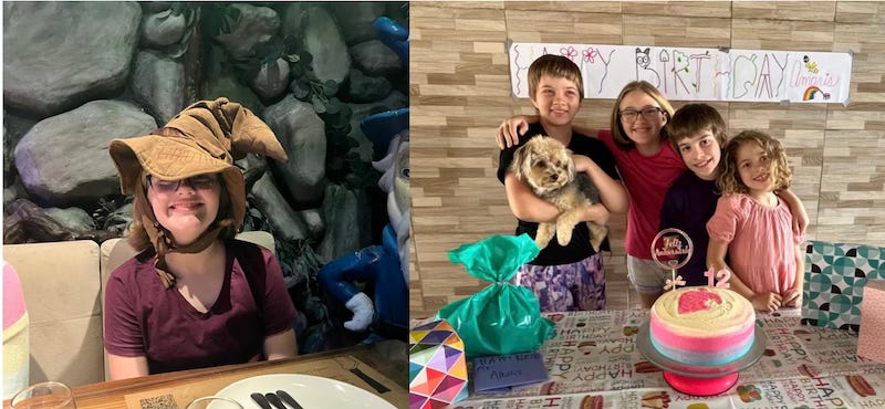
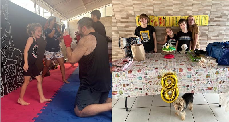
In January we celebrate two birthdays!
Amaris turned 12 years old and Adalee turned 8. We celebrated their special days with birthday cake for breakfast, special activities of their choosing, games, and family fun time.
Adalee wanted to go to Muay Thai practice with mom and dad on the morning of her birthday. She wore dad out on the practice mat and then celebrated with mom cuddles.
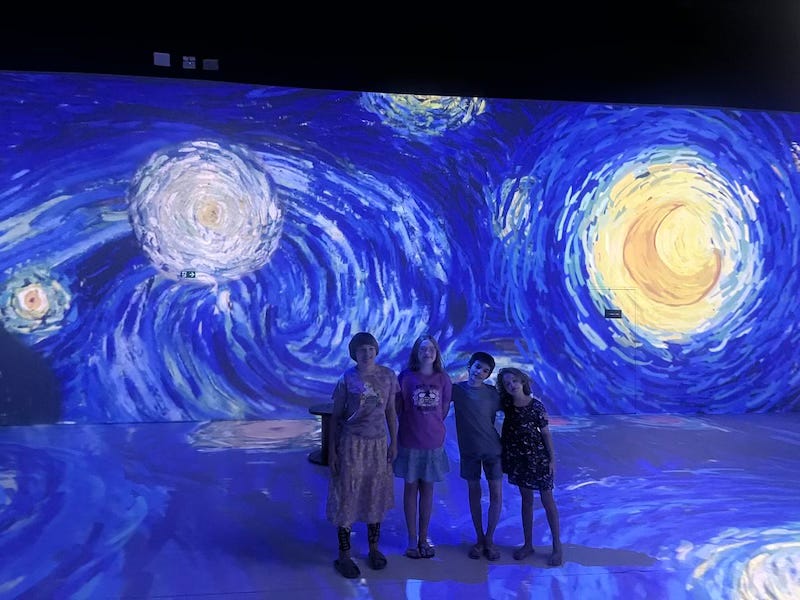
Amaris is our creative kid, and her special day was filled with creativity, art, makeup, and special treats. We also took the family to a LOTR themed restaurant here, where you get to eat among the Ent forrest.
We are very proud of these girls. They are great kiddos, learning to follow Christ, growing in knowing the language and culture, making friends, practicing jiu-jitsu, doing well in school, and wonderfully serving as missionaries here alongside mom and dad.
Thank you all for the birthday wishes for these sweet girls and for your ongoing support of the Kingdom work here.
‘Til next month!
© 2026 Derek Blaylock
Xingu Mission USA, PO Box 340785, Columbus, Ohio 43234
Unsubscribe
 
|
|

