Blaylock Missions – February 2026 @media (max-width: 1024px) { .typography .pullquote-align-left, .typography.editor .pullquote-align-left, .typography .pullquote-align-right, .typography.editor .pullquote-align-right, .typography .pullquote-align-wide, .typography.editor .pullquote-align-wide, .typography .pullquote-align-center, .typography.editor .pullquote-align-center { float: none; margin: 0 auto; width: 100%; max-width: 100%; } } @media all and (-ms-high-contrast: none), (-ms-high-contrast: active) { .typography .markup table.image-wrapper img, .typography.editor .markup table.image-wrapper img, .typography .markup table.kindle-wrapper img, .typography.editor .markup table.kindle-wrapper img { max-width: 550px; } } @media (min-width: 1024px) { .typography:not(:has(#toc)) .captioned-image-container figure:has(> a.image2-offset-left), .typography.editor:not(:has(#toc)) .captioned-image-container figure:has(> a.image2-offset-left) { margin-left: var(–image-offset-margin); } .typography:not(:has(#toc)) .captioned-image-container figure:has(> a.image2-offset-right), .typography.editor:not(:has(#toc)) .captioned-image-container figure:has(> a.image2-offset-right) { margin-right: var(–image-offset-margin); } } @media (min-width: 1300px) { .typography .captioned-image-container figure:has(> a.image2-offset-left), .typography.editor .captioned-image-container figure:has(> a.image2-offset-left) { margin-left: var(–image-offset-margin); } .typography .captioned-image-container figure:has(> a.image2-offset-right), .typography.editor .captioned-image-container figure:has(> a.image2-offset-right) { margin-right: var(–image-offset-margin); } } @media (max-width: 1024px) { .typography, .typography.editor { } .typography .captioned-image-container figure:has(> a.image2-align-left), .typography.editor .captioned-image-container figure:has(> a.image2-align-left), .typography .captioned-image-container figure:has(> a.image2-align-right), .typography.editor .captioned-image-container figure:has(> a.image2-align-right) { float: none; margin: 1em auto; max-width: 100%; width: auto; padding: 0; } .typography .captioned-image-container figure:has(> a.image2-align-left.thefp), .typography.editor .captioned-image-container figure:has(> a.image2-align-left.thefp), .typography .captioned-image-container figure:has(> a.image2-align-right.thefp), .typography.editor .captioned-image-container figure:has(> a.image2-align-right.thefp) { margin: 1em auto; } .typography .captioned-image-container figure:has(> a.image2-offset-left), .typography.editor .captioned-image-container figure:has(> a.image2-offset-left), .typography .captioned-image-container figure:has(> a.image2-offset-right), .typography.editor .captioned-image-container figure:has(> a.image2-offset-right) { margin: 1em auto; } .typography .captioned-image-container figure:has(> a.image2-align-left) .image2-inset, .typography.editor .captioned-image-container figure:has(> a.image2-align-left) .image2-inset, .typography .captioned-image-container figure:has(> a.image2-align-right) .image2-inset, .typography.editor .captioned-image-container figure:has(> a.image2-align-right) .image2-inset { display: block; justify-content: initial; } } @media (max-width: 768px) { .typography .markup div.sponsorship-campaign-embed, .typography.editor .markup div.sponsorship-campaign-embed { margin-top: 24px; margin-bottom: 24px; } .typography .markup div.sponsorship-campaign-embed:first-child, .typography.editor .markup div.sponsorship-campaign-embed:first-child { margin-top: 0px; } } @media screen and (max-width: 650px) { .typography .markup div.youtube-overlay, .typography.editor .markup div.youtube-overlay, .typography .markup div.vimeo-overlay, .typography.editor .markup div.vimeo-overlay { display: none !important; } } @media screen and (max-width: 370px) { .typography .markup div.tiktok-wrap, .typography.editor .markup div.tiktok-wrap { width: calc(95vw – 32px); height: calc((95vw – 32px – 2px) / 0.485714); } } @media screen and (max-width: 650px) { .typography .markup div.embedded-publication-wrap .embedded-publication.show-subscribe, .typography.editor .markup div.embedded-publication-wrap .embedded-publication.show-subscribe { padding: 24px; } } @media screen and (max-width: 650px) { .typography .markup div.subscription-widget-wrap .subscription-widget.show-subscribe, .typography.editor .markup div.subscription-widget-wrap .subscription-widget.show-subscribe, .typography .markup div.subscription-widget-wrap-editor .subscription-widget.show-subscribe, .typography.editor .markup div.subscription-widget-wrap-editor .subscription-widget.show-subscribe, .typography .markup div.captioned-button-wrap .subscription-widget.show-subscribe, .typography.editor .markup div.captioned-button-wrap .subscription-widget.show-subscribe { padding: 0px 24px; } } @media screen and (max-width: 650px) { .typography .markup div.subscription-widget-wrap .subscription-widget.show-subscribe .subscription-widget-subscribe .button, .typography.editor .markup div.subscription-widget-wrap .subscription-widget.show-subscribe .subscription-widget-subscribe .button, .typography .markup div.subscription-widget-wrap-editor .subscription-widget.show-subscribe .subscription-widget-subscribe .button, .typography.editor .markup div.subscription-widget-wrap-editor .subscription-widget.show-subscribe .subscription-widget-subscribe .button, .typography .markup div.captioned-button-wrap .subscription-widget.show-subscribe .subscription-widget-subscribe .button, .typography.editor .markup div.captioned-button-wrap .subscription-widget.show-subscribe .subscription-widget-subscribe .button { padding: 10px 12px; min-width: 110px; } } @media (max-width: 650px) { .typography .markup .twitter-embed, .typography.editor .markup .twitter-embed, .typography .markup .tweet, .typography.editor .markup .tweet { padding: 12px; } } @media (max-width: 650px) { .typography .markup .twitter-embed .tweet-text, .typography.editor .markup .twitter-embed .tweet-text, .typography .markup .tweet .tweet-text, .typography.editor .markup .tweet .tweet-text { font-size: 14px; line-height: 20px; } } @media (max-width: 650px) { .typography .markup .twitter-embed .tweet-photos-container.two, .typography.editor .markup .twitter-embed .tweet-photos-container.two, .typography .markup .tweet .tweet-photos-container.two, .typography.editor .markup .tweet .tweet-photos-container.two, .typography .markup .twitter-embed .tweet-photos-container.three, .typography.editor .markup .twitter-embed .tweet-photos-container.three, .typography .markup .tweet .tweet-photos-container.three, .typography.editor .markup .tweet .tweet-photos-container.three, .typography .markup .twitter-embed .tweet-photos-container.four, .typography.editor .markup .twitter-embed .tweet-photos-container.four, .typography .markup .tweet .tweet-photos-container.four, .typography.editor .markup .tweet .tweet-photos-container.four { height: 200px; } } @media (max-width: 650px) { .typography .markup .twitter-embed a.expanded-link .expanded-link-img, .typography.editor .markup .twitter-embed a.expanded-link .expanded-link-img, .typography .markup .tweet a.expanded-link .expanded-link-img, .typography.editor .markup .tweet a.expanded-link .expanded-link-img { max-height: 180px; } } @media (max-width: 650px) { .typography .markup .twitter-embed a.expanded-link .expanded-link-description, .typography.editor .markup .twitter-embed a.expanded-link .expanded-link-description, .typography .markup .tweet a.expanded-link .expanded-link-description, .typography.editor .markup .tweet a.expanded-link .expanded-link-description { display: none; } } @media screen and (max-width: 650px) { .typography .markup .apple-podcast-container, .typography.editor .markup .apple-podcast-container { width: unset; } } @media (max-width: 420px) { .typography .markup .install-substack-app-embed img.install-substack-app-embed-img, .typography.editor .markup .install-substack-app-embed img.install-substack-app-embed-img { margin: 0 auto 16px auto; } } @media (max-width: 420px) { .typography .markup .install-substack-app-embed .install-substack-app-embed-text, .typography.editor .markup .install-substack-app-embed .install-substack-app-embed-text { margin: 0 0 12px 0; max-width: 100%; width: auto; text-align: center; } } @media (max-width: 420px) { .typography .markup .install-substack-app-embed .install-substack-app-embed-link, .typography.editor .markup .install-substack-app-embed .install-substack-app-embed-link { display: flex; justify-content: center; } } @media screen and (min-width: 481px) { .share-button-container { height: 38px; } } @media screen and (min-width: 481px) { .share-button-container a.comment { height: 38px; line-height: 38px; padding-right: 10px; } } @media screen and (max-width: 480px) { .share-button-container .separator { display: block; margin: 0; height: 8px; border-left: none; } } @media screen and (max-width: 480px) { .share-button-container a.share.first img { padding-left: 0; } } @media screen and (min-width: 481px) { .share-button-container a.mobile { display: none !important; } } @media screen and (min-width: 541px) { .settings-add-pub-modal-wrapper .container .add-recommending-pub-modal-container { padding: 36px; height: 680px; } } @media screen and (min-width: 541px) { .settings-add-pub-modal-wrapper .container .add-recommending-pub-modal-container .footer { position: absolute; bottom: 36px; margin: 0px; } } @media screen and (max-width: 650px) { .header-anchor-parent { display: none; } } @media screen and (max-width: 768px) { .post { padding: 16px 0 0 0; } } @media screen and (max-width: 650px) { .post .post-header .post-label { margin-top: 8px; } } @media screen and (max-width: 650px) { .post .post-header .meta-author-wrap.alternative-meta .meta-right-column .post-meta { margin-top: 6px; } } @media screen and (max-width: 650px) { .post .footer-facepile-container { height: 64px; padding: 0 16px; display: flex; align-items: center; justify-content: flex-start; width: 100%; } } @media screen and (max-width: 650px) { .post .post-footer.use-separators { justify-content: center; } } @media screen and (max-width: 650px) { .post .post-footer.next-prev { height: 64px; justify-content: space-between; box-sizing: border-box; } } @media screen and (max-width: 650px) { .post-contributor-footer .post-contributor-bio-table { display: block; } .post-contributor-footer .post-contributor-bio-table-row { display: flex; flex-direction: row; } .post-contributor-footer .post-contributor-bio-userhead-cell, .post-contributor-footer .post-contributor-bio-body-cell { display: block; } .post-contributor-footer .post-contributor-bio-body-cell { flex-grow: 1; } .post-contributor-footer .post-contributor-bio-body-table { display: block; } .post-contributor-footer .post-contributor-bio-body-table-row { display: block; } .post-contributor-footer .post-contributor-bio-copy-cell, .post-contributor-footer .post-contributor-bio-controls-cell { display: block; } .post-contributor-footer .post-contributor-bio-copy-cell { margin: 0 0 16px 0; } .post-contributor-footer .post-contributor-bio-controls-cell { width: auto; } .post-contributor-footer .post-contributor-bio-controls { margin: auto; } .post-contributor-footer .post-contributor-bio-controls .button.primary { width: 100%; } .post-contributor-footer .post-contributor-bio-text { font-size: 14px; } } @media screen and (min-width: 768px) { .post-silhouette { padding: 32px 0; } } @media screen and (max-width: 650px) { .post-silhouette .post-silhouette-title { margin-top: 10.44225025px; height: 120px; } } @media screen and (max-width: 650px) { .post-silhouette .post-silhouette-meta { width: 75%; } } @media screen and (max-width: 650px) { .post-silhouette .post-silhouette-meta.with-byline-image { margin: 20px 0; } } @media screen and (max-width: 650px) { .use-theme-bg .post-meta.alternative-meta .post-meta-item, .post-meta.alternative-meta .post-meta-item { padding-right: 16px; } } @media screen and (max-width: 370px) { .use-theme-bg .post-meta.alternative-meta .post-meta-item, .post-meta.alternative-meta .post-meta-item { font-size: 14px; } } @media screen and (max-width: 650px) { .use-theme-bg .post-meta.alternative-meta .post-meta-item.guest-author-publication, .post-meta.alternative-meta .post-meta-item.guest-author-publication { display: none; } } @media screen and (max-width: 370px) { .post-meta .post-meta-item .post-meta-button { height: 36px !important; } .post-meta .post-meta-item .post-meta-button .meta-button-label { display: none; } .post-meta .post-meta-item .post-meta-button > svg { margin-right: 0; } } @media screen and (max-width: 370px) { .post-meta .post-meta-item { font-size: 12px; } } @media screen and (max-width: 650px) { .post .floating-subscribe-button { bottom: 20px; right: 20px; } } @media (max-width: 1024px) { body .pullquote-align-left, body .pullquote-align-right, body .pullquote-align-wide, body .pullquote-align-center { float: none; margin: 0 auto; width: 100%; max-width: 100%; } } @media all and (-ms-high-contrast: none), (-ms-high-contrast: active) { body .markup table.image-wrapper img, body .markup table.kindle-wrapper img { max-width: 550px; } } @media (min-width: 1024px) { body:not(:has(#toc)) .captioned-image-container figure:has(> a.image2-offset-left) { margin-left: var(–image-offset-margin); } body:not(:has(#toc)) .captioned-image-container figure:has(> a.image2-offset-right) { margin-right: var(–image-offset-margin); } } @media (min-width: 1300px) { body .captioned-image-container figure:has(> a.image2-offset-left) { margin-left: var(–image-offset-margin); } body .captioned-image-container figure:has(> a.image2-offset-right) { margin-right: var(–image-offset-margin); } } @media (max-width: 1024px) { body { } body .captioned-image-container figure:has(> a.image2-align-left), body .captioned-image-container figure:has(> a.image2-align-right) { float: none; margin: 1em auto; max-width: 100%; width: auto; padding: 0; } body .captioned-image-container figure:has(> a.image2-align-left.thefp), body .captioned-image-container figure:has(> a.image2-align-right.thefp) { margin: 1em auto; } body .captioned-image-container figure:has(> a.image2-offset-left), body .captioned-image-container figure:has(> a.image2-offset-right) { margin: 1em auto; } body .captioned-image-container figure:has(> a.image2-align-left) .image2-inset, body .captioned-image-container figure:has(> a.image2-align-right) .image2-inset { display: block; justify-content: initial; } } @media (max-width: 768px) { body .markup div.sponsorship-campaign-embed { margin-top: 24px; margin-bottom: 24px; } body .markup div.sponsorship-campaign-embed:first-child { margin-top: 0px; } } @media screen and (max-width: 650px) { body .markup div.youtube-overlay, body .markup div.vimeo-overlay { display: none !important; } } @media screen and (max-width: 370px) { body .markup div.tiktok-wrap { width: calc(95vw – 32px); height: calc((95vw – 32px – 2px) / 0.485714); } } @media screen and (max-width: 650px) { body .markup div.embedded-publication-wrap .embedded-publication.show-subscribe { padding: 24px; } } @media screen and (max-width: 650px) { body .markup div.subscription-widget-wrap .subscription-widget.show-subscribe, body .markup div.subscription-widget-wrap-editor .subscription-widget.show-subscribe, body .markup div.captioned-button-wrap .subscription-widget.show-subscribe { padding: 0px 24px; } } @media screen and (max-width: 650px) { body .markup div.subscription-widget-wrap .subscription-widget.show-subscribe .subscription-widget-subscribe .button, body .markup div.subscription-widget-wrap-editor .subscription-widget.show-subscribe .subscription-widget-subscribe .button, body .markup div.captioned-button-wrap .subscription-widget.show-subscribe .subscription-widget-subscribe .button { padding: 10px 12px; min-width: 110px; } } @media (max-width: 650px) { body .markup .twitter-embed, body .markup .tweet { padding: 12px; } } @media (max-width: 650px) { body .markup .twitter-embed .tweet-text, body .markup .tweet .tweet-text { font-size: 14px; line-height: 20px; } } @media (max-width: 650px) { body .markup .twitter-embed .tweet-photos-container.two, body .markup .tweet .tweet-photos-container.two, body .markup .twitter-embed .tweet-photos-container.three, body .markup .tweet .tweet-photos-container.three, body .markup .twitter-embed .tweet-photos-container.four, body .markup .tweet .tweet-photos-container.four { height: 200px; } } @media (max-width: 650px) { body .markup .twitter-embed a.expanded-link .expanded-link-img, body .markup .tweet a.expanded-link .expanded-link-img { max-height: 180px; } } @media (max-width: 650px) { body .markup .twitter-embed a.expanded-link .expanded-link-description, body .markup .tweet a.expanded-link .expanded-link-description { display: none; } } @media screen and (max-width: 650px) { body .markup .apple-podcast-container { width: unset; } } @media (max-width: 420px) { body .markup .install-substack-app-embed img.install-substack-app-embed-img { margin: 0 auto 16px auto; } } @media (max-width: 420px) { body .markup .install-substack-app-embed .install-substack-app-embed-text { margin: 0 0 12px 0; max-width: 100%; width: auto; text-align: center; } } @media (max-width: 420px) { body .markup .install-substack-app-embed .install-substack-app-embed-link { display: flex; justify-content: center; } } @media screen and (min-width: 500px) { body .header a.logo { width: 42px; height: 42px; border-radius: 12px; } } @media screen and (max-width: 420px) { body .subscription-receipt table:first-of-type .subscription-amount .subscription-discount { width: 72px !important; } } @media screen and (min-width: 481px) { body .share-button-container { height: auto; } } @media screen and (max-width: 480px) { body .share-button-container .separator { display: block !important; margin: 0 !important; height: 8px !important; border-left: none !important; } } @media screen and (max-width: 650px) { .digest .item .post-meta-item.audience { display: none; } } @media screen and (min-width: 500px) { .digest-publication .logo img { width: 42px; height: 42px; border-radius: 8px; } } @media screen and (max-width: 650px) { .comments-page .container .comment-list .collapsed-reply { margin-left: calc(10 + 32px – 24px); } } @media screen and (max-width: 650px) { .comment > .comment-list { padding-left: 24px; } } @media screen and (max-width: 650px) { .finish-magic-login-modal .modal-content .container { padding: 24px 0; } } @media (max-width: 650px) { .reader2-text-b3 { line-height: 24px; } } @media screen and (max-width: 650px) { .reader2-text-h4 { line-height: 24px; } } @media screen and (min-width: 541px) { .user-profile-modal { padding-left: 12px; padding-right: 12px; } } @media screen and (max-width: 650px) { .subscribe-widget form.form .sideBySideWrap button.rightButton { padding: 10px 12px; } } @media screen and (min-width: 541px) { .pub-icon:hover .logo-hover, .feed-item-icon:hover .logo-hover { display: block; } } @media screen and (max-width: 650px) { .post-ufi.single-full-width-button .post-ufi-button-wrapper { width: 100%; padding: 16px; } .post-ufi.single-full-width-button .post-ufi-button-wrapper:empty { display: none; } .post-ufi.single-full-width-button .post-ufi-button { width: 100%; justify-content: center; } } @media screen and (max-width: 768px) { .file-embed-wrapper { padding: 0; } } @media screen and (max-width: 768px) { .file-embed-wrapper-editor { padding: 0; } } @media screen and (max-width: 768px) { .file-embed-wrapper-editor:active { padding: 0; } } @media only screen and (max-width: 650px) { .file-embed-button.wide, .file-embed-error-button.wide { display: none; } } @media only screen and (min-width: 630px) { .file-embed-button.narrow, .file-embed-error-button.narrow { display: none; } } @media screen and (min-width: 541px) { .audio-player-wrapper .audio-player { min-width: 500px; } } @media screen and (max-width: 650px) { .audio-player-wrapper .audio-player .audio-player-progress { border-left-width: 16px; border-right-width: 16px; } } @media screen and (max-width: 650px) { .audio-player-wrapper .audio-player .audio-player-progress .audio-player-progress-bar .audio-player-progress-bar-popup { top: -54px; } } @media screen and (max-width: 650px) { .audio-player-wrapper-fancy .audio-player .audio-player-progress { border-left-width: 16px; border-right-width: 16px; } } @media screen and (max-width: 650px) { .audio-player-wrapper-fancy .audio-player .audio-player-progress .audio-player-progress-bar .audio-player-progress-bar-popup { top: -54px; } } @media (min-width: 250px) { .audio-player-wrapper-fancy .audio-player { padding: 32px; } .audio-player-wrapper-fancy .audio-player .btn-group { display: flex; } .audio-player-wrapper-fancy .audio-player .btn-group .button:last-of-type { display: block; } } @media (min-width: 300px) { .audio-player-wrapper-fancy .audio-player .btn-group { display: block; } .audio-player-wrapper-fancy .audio-player .btn-group .button:first-of-type { display: block; } } @media (min-width: 350px) { .audio-player-wrapper-fancy .audio-player .audio-player-substack-logo { display: block; } .audio-player-wrapper-fancy .audio-player .audio-player-title { margin-top: 16px; } .audio-player-wrapper-fancy .audio-player .audio-player-hero-image-container { padding-top: 15%; width: 15%; display: block; } .audio-player-wrapper-fancy .audio-player .btn-group .button:first-of-type { display: block; } .audio-player-wrapper-fancy .audio-player .audio-player-substack-logo { display: block; } } @media (min-width: 350px) { .audio-player-wrapper-fancy .audio-player .audio-player-hero-image-container { padding-top: 25%; width: 25%; display: block; } .audio-player-wrapper-fancy .audio-player .btn-group { display: flex; } .audio-player-wrapper-fancy .audio-player .btn-group .button:first-of-type { display: block; } } @media (min-width: 400px) { .audio-player-wrapper-fancy .audio-player .audio-player-hero-image-container { padding-top: 40%; width: 40%; } } @media (max-width: 400px) { .audio-player-wrapper-fancy .audio-player .btn-group { margin-top: 12px; } .audio-player-wrapper-fancy .audio-player .btn-group .button { font-size: 13px; padding: 6px 12px; height: auto; margin-top: 10px; } } @media (min-width: 600px) { .audio-player-wrapper-fancy .audio-player .audio-player-hero-image-container { padding-top: 55%; width: 55%; } } @media (max-width: 650px) { .poll-editor-modal { min-width: calc(100% – 20px); } } @media (max-width: 750px) { .poll-embed .poll-anchor-target .poll-anchor-copy-button { left: 8px; top: 45px; } }

Hello Friends,
͏ ͏ ͏ ͏ ͏ ͏ ͏ ͏ ͏ ͏ ͏ ͏ ͏ ͏ ͏ ͏ ͏ ͏ ͏ ͏ ͏ ͏ ͏ ͏ ͏ ͏ ͏ ͏ ͏ ͏ ͏ ͏ ͏ ͏ ͏ ͏ ͏ ͏ ͏ ͏ ͏ ͏ ͏ ͏ ͏ ͏ ͏ ͏ ͏ ͏ ͏ ͏ ͏ ͏ ͏ ͏ ͏ ͏ ͏ ͏ ͏ ͏ ͏ ͏ ͏ ͏ ͏ ͏ ͏ ͏ ͏ ͏ ͏ ͏ ͏ ͏ ͏ ͏ ͏ ͏ ͏ ͏ ͏ ͏ ͏ ͏ ͏ ͏ ͏ ͏ ͏ ͏ ͏ ͏ ͏ ͏ ͏ ͏ ͏ ͏ ͏ ͏ ͏ ͏ ͏ ͏ ͏ ͏ ͏ ͏ ͏ ͏ ͏ ͏ ͏ ͏ ͏ ͏ ͏ ͏ ͏ ͏ ͏ ͏ ͏ ͏ ͏ ͏ ͏ ͏ ͏ ͏ ͏ ͏ ͏ ͏ ͏ ͏ ͏ ͏ ͏ ͏ ͏ ͏ ͏ ͏ ͏ ͏ ͏ ͏ ͏ ͏ ͏ ͏ ͏ ͏ ͏ ͏ ͏ ͏ ͏ ͏ ͏ ͏ ͏ ͏ ͏ ͏ ͏ ͏ ͏ ͏ ͏ ͏ ͏ ͏ ͏ ͏ ͏ ͏ ͏ ͏ ͏ ͏ ͏ ͏ ͏ ͏ ͏ ͏ ͏ ͏ ͏ ͏ ͏ ͏ ͏ ͏ ͏ ͏
|
|
|
|
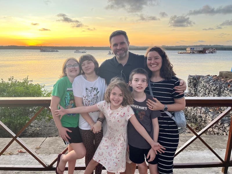
Missão Xingu: Blaylocks in Brazil
Hello Friends,
Its going to be a short update this month. Mainly because we are in a very busy season (in a good way)!
Overall the family is doing well. Strep throat has been making its way through the kiddos, so please pray for health for us and them. Our kids have been making great strides in their language learning and in making friends – even taking the initiative to start inviting people over to our house to play. Its been wonderful to see them learning, growing, having fun, and overall thriving here. Last month, Amanda was struck by some pretty severe migraines. A few of your reached out to me saying that the Lord had prompted you to pray for her! Im happy to report that these last few weeks have been much better on that front. Overall, our family is doing well.
On the ministry side of things Vineyard Renovar has been growing! We have had several new families join us over the past 6-8 weeks. We are hitting our stride with a corporate rule of life, in building community, in outreach, in growing as disciples. Its been very encouraging and keeping us busy. Our second simple church here in Mangabeira has been going through some painful issues – funerals and illnesses. We have started meeting again on the regular and folks are in a bit better spirits. We are needing to find a new meeting space for this one so prayers are appreciated. There is a a third simple church that we support as we can who are outside of the city and they likewise are doing well. The pastor of that group and his family are looking to relocate closer and need prayers for finding a house and navigating expecting a new baby! They also had a professional grant writer agree to volunteer some time to help them pursue government funding for thier kid’s after school program. Please pray for favor with that. Overall it is a good but busy time of ministry.
Thank you for your prayers, encouragement, and support! We could not do this without you.
Donations:
If you would like to donate to the ministry you can do so through through the mission’s secure giving portal here:
Donate Here
Prayer Request
-
For salvations, baptisms, and “doing the stuff” in our simple churches.
-
For those that are called into greater leadership to hear God’s voice and follow Him into adventure and obedience!
-
For God to begin bringing together a group of students for the launch of our Portuguese Spiritual Direction training program.
-
Pray against the spiritual warfare for our churches. Especially our church in Mangabeira.
-
For discernment in the purchasing a house this year. We have started looking.
With Love,
The Blaylocks
© 2026 Derek Blaylock
Xingu Mission USA, PO Box 340785, Columbus, Ohio 43234
Unsubscribe
 
|
|

