Blaylock Missions – August 2026 @media (max-width: 1024px) { .typography .pullquote-align-left, .typography.editor .pullquote-align-left, .typography .pullquote-align-right, .typography.editor .pullquote-align-right, .typography .pullquote-align-wide, .typography.editor .pullquote-align-wide, .typography .pullquote-align-center, .typography.editor .pullquote-align-center { float: none; margin: 0 auto; width: 100%; max-width: 100%; } } @media all and (-ms-high-contrast: none), (-ms-high-contrast: active) { .typography .markup table.image-wrapper img, .typography.editor .markup table.image-wrapper img, .typography .markup table.kindle-wrapper img, .typography.editor .markup table.kindle-wrapper img { max-width: 550px; } } @media (min-width: 1024px) { .typography:not(:has(#toc)) .captioned-image-container figure:has(> a.image2-offset-left), .typography.editor:not(:has(#toc)) .captioned-image-container figure:has(> a.image2-offset-left) { margin-left: var(–image-offset-margin); } .typography:not(:has(#toc)) .captioned-image-container figure:has(> a.image2-offset-right), .typography.editor:not(:has(#toc)) .captioned-image-container figure:has(> a.image2-offset-right) { margin-right: var(–image-offset-margin); } } @media (min-width: 1300px) { .typography .captioned-image-container figure:has(> a.image2-offset-left), .typography.editor .captioned-image-container figure:has(> a.image2-offset-left) { margin-left: var(–image-offset-margin); } .typography .captioned-image-container figure:has(> a.image2-offset-right), .typography.editor .captioned-image-container figure:has(> a.image2-offset-right) { margin-right: var(–image-offset-margin); } } @media (max-width: 1024px) { .typography, .typography.editor { } .typography .captioned-image-container figure:has(> a.image2-align-left), .typography.editor .captioned-image-container figure:has(> a.image2-align-left), .typography .captioned-image-container figure:has(> a.image2-align-right), .typography.editor .captioned-image-container figure:has(> a.image2-align-right) { float: none; margin: 1em auto; max-width: 100%; width: auto; padding: 0; } .typography .captioned-image-container figure:has(> a.image2-align-left.thefp), .typography.editor .captioned-image-container figure:has(> a.image2-align-left.thefp), .typography .captioned-image-container figure:has(> a.image2-align-right.thefp), .typography.editor .captioned-image-container figure:has(> a.image2-align-right.thefp) { margin: 1em auto; } .typography .captioned-image-container figure:has(> a.image2-offset-left), .typography.editor .captioned-image-container figure:has(> a.image2-offset-left), .typography .captioned-image-container figure:has(> a.image2-offset-right), .typography.editor .captioned-image-container figure:has(> a.image2-offset-right) { margin: 1em auto; } .typography .captioned-image-container figure:has(> a.image2-align-left) .image2-inset, .typography.editor .captioned-image-container figure:has(> a.image2-align-left) .image2-inset, .typography .captioned-image-container figure:has(> a.image2-align-right) .image2-inset, .typography.editor .captioned-image-container figure:has(> a.image2-align-right) .image2-inset { display: block; justify-content: initial; } } @media (max-width: 768px) { .typography .markup div.sponsorship-campaign-embed, .typography.editor .markup div.sponsorship-campaign-embed { margin-top: 24px; margin-bottom: 24px; } .typography .markup div.sponsorship-campaign-embed:first-child, .typography.editor .markup div.sponsorship-campaign-embed:first-child { margin-top: 0px; } } @media screen and (max-width: 650px) { .typography .markup div.youtube-overlay, .typography.editor .markup div.youtube-overlay, .typography .markup div.vimeo-overlay, .typography.editor .markup div.vimeo-overlay { display: none !important; } } @media screen and (max-width: 370px) { .typography .markup div.tiktok-wrap, .typography.editor .markup div.tiktok-wrap { width: calc(95vw – 32px); height: calc((95vw – 32px – 2px) / 0.485714); } } @media screen and (max-width: 650px) { .typography .markup div.embedded-publication-wrap .embedded-publication.show-subscribe, .typography.editor .markup div.embedded-publication-wrap .embedded-publication.show-subscribe { padding: 24px; } } @media screen and (max-width: 650px) { .typography .markup div.subscription-widget-wrap .subscription-widget.show-subscribe, .typography.editor .markup div.subscription-widget-wrap .subscription-widget.show-subscribe, .typography .markup div.subscription-widget-wrap-editor .subscription-widget.show-subscribe, .typography.editor .markup div.subscription-widget-wrap-editor .subscription-widget.show-subscribe, .typography .markup div.captioned-button-wrap .subscription-widget.show-subscribe, .typography.editor .markup div.captioned-button-wrap .subscription-widget.show-subscribe { padding: 0px 24px; } } @media screen and (max-width: 650px) { .typography .markup div.subscription-widget-wrap .subscription-widget.show-subscribe .subscription-widget-subscribe .button, .typography.editor .markup div.subscription-widget-wrap .subscription-widget.show-subscribe .subscription-widget-subscribe .button, .typography .markup div.subscription-widget-wrap-editor .subscription-widget.show-subscribe .subscription-widget-subscribe .button, .typography.editor .markup div.subscription-widget-wrap-editor .subscription-widget.show-subscribe .subscription-widget-subscribe .button, .typography .markup div.captioned-button-wrap .subscription-widget.show-subscribe .subscription-widget-subscribe .button, .typography.editor .markup div.captioned-button-wrap .subscription-widget.show-subscribe .subscription-widget-subscribe .button { padding: 10px 12px; min-width: 110px; } } @media (max-width: 650px) { .typography .markup .twitter-embed, .typography.editor .markup .twitter-embed, .typography .markup .tweet, .typography.editor .markup .tweet { padding: 12px; } } @media (max-width: 650px) { .typography .markup .twitter-embed .tweet-text, .typography.editor .markup .twitter-embed .tweet-text, .typography .markup .tweet .tweet-text, .typography.editor .markup .tweet .tweet-text { font-size: 14px; line-height: 20px; } } @media (max-width: 650px) { .typography .markup .twitter-embed .tweet-photos-container.two, .typography.editor .markup .twitter-embed .tweet-photos-container.two, .typography .markup .tweet .tweet-photos-container.two, .typography.editor .markup .tweet .tweet-photos-container.two, .typography .markup .twitter-embed .tweet-photos-container.three, .typography.editor .markup .twitter-embed .tweet-photos-container.three, .typography .markup .tweet .tweet-photos-container.three, .typography.editor .markup .tweet .tweet-photos-container.three, .typography .markup .twitter-embed .tweet-photos-container.four, .typography.editor .markup .twitter-embed .tweet-photos-container.four, .typography .markup .tweet .tweet-photos-container.four, .typography.editor .markup .tweet .tweet-photos-container.four { height: 200px; } } @media (max-width: 650px) { .typography .markup .twitter-embed a.expanded-link .expanded-link-img, .typography.editor .markup .twitter-embed a.expanded-link .expanded-link-img, .typography .markup .tweet a.expanded-link .expanded-link-img, .typography.editor .markup .tweet a.expanded-link .expanded-link-img { max-height: 180px; } } @media (max-width: 650px) { .typography .markup .twitter-embed a.expanded-link .expanded-link-description, .typography.editor .markup .twitter-embed a.expanded-link .expanded-link-description, .typography .markup .tweet a.expanded-link .expanded-link-description, .typography.editor .markup .tweet a.expanded-link .expanded-link-description { display: none; } } @media screen and (max-width: 650px) { .typography .markup .apple-podcast-container, .typography.editor .markup .apple-podcast-container { width: unset; } } @media (max-width: 420px) { .typography .markup .install-substack-app-embed img.install-substack-app-embed-img, .typography.editor .markup .install-substack-app-embed img.install-substack-app-embed-img { margin: 0 auto 16px auto; } } @media (max-width: 420px) { .typography .markup .install-substack-app-embed .install-substack-app-embed-text, .typography.editor .markup .install-substack-app-embed .install-substack-app-embed-text { margin: 0 0 12px 0; max-width: 100%; width: auto; text-align: center; } } @media (max-width: 420px) { .typography .markup .install-substack-app-embed .install-substack-app-embed-link, .typography.editor .markup .install-substack-app-embed .install-substack-app-embed-link { display: flex; justify-content: center; } } @media screen and (min-width: 481px) { .share-button-container { height: 38px; } } @media screen and (min-width: 481px) { .share-button-container a.comment { height: 38px; line-height: 38px; padding-right: 10px; } } @media screen and (max-width: 480px) { .share-button-container .separator { display: block; margin: 0; height: 8px; border-left: none; } } @media screen and (max-width: 480px) { .share-button-container a.share.first img { padding-left: 0; } } @media screen and (min-width: 481px) { .share-button-container a.mobile { display: none !important; } } @media screen and (min-width: 541px) { .settings-add-pub-modal-wrapper .container .add-recommending-pub-modal-container { padding: 36px; height: 680px; } } @media screen and (min-width: 541px) { .settings-add-pub-modal-wrapper .container .add-recommending-pub-modal-container .footer { position: absolute; bottom: 36px; margin: 0px; } } @media screen and (max-width: 650px) { .header-anchor-parent { display: none; } } @media screen and (max-width: 768px) { .post { padding: 16px 0 0 0; } } @media screen and (max-width: 650px) { .post .post-header .post-label { margin-top: 8px; } } @media screen and (max-width: 650px) { .post .post-header .meta-author-wrap.alternative-meta .meta-right-column .post-meta { margin-top: 6px; } } @media screen and (max-width: 650px) { .post .footer-facepile-container { height: 64px; padding: 0 16px; display: flex; align-items: center; justify-content: flex-start; width: 100%; } } @media screen and (max-width: 650px) { .post .post-footer.use-separators { justify-content: center; } } @media screen and (max-width: 650px) { .post .post-footer.next-prev { height: 64px; justify-content: space-between; box-sizing: border-box; } } @media screen and (max-width: 650px) { .post-contributor-footer .post-contributor-bio-table { display: block; } .post-contributor-footer .post-contributor-bio-table-row { display: flex; flex-direction: row; } .post-contributor-footer .post-contributor-bio-userhead-cell, .post-contributor-footer .post-contributor-bio-body-cell { display: block; } .post-contributor-footer .post-contributor-bio-body-cell { flex-grow: 1; } .post-contributor-footer .post-contributor-bio-body-table { display: block; } .post-contributor-footer .post-contributor-bio-body-table-row { display: block; } .post-contributor-footer .post-contributor-bio-copy-cell, .post-contributor-footer .post-contributor-bio-controls-cell { display: block; } .post-contributor-footer .post-contributor-bio-copy-cell { margin: 0 0 16px 0; } .post-contributor-footer .post-contributor-bio-controls-cell { width: auto; } .post-contributor-footer .post-contributor-bio-controls { margin: auto; } .post-contributor-footer .post-contributor-bio-controls .button.primary { width: 100%; } .post-contributor-footer .post-contributor-bio-text { font-size: 14px; } } @media screen and (min-width: 768px) { .post-silhouette { padding: 32px 0; } } @media screen and (max-width: 650px) { .post-silhouette .post-silhouette-title { margin-top: 10.44225025px; height: 120px; } } @media screen and (max-width: 650px) { .post-silhouette .post-silhouette-meta { width: 75%; } } @media screen and (max-width: 650px) { .post-silhouette .post-silhouette-meta.with-byline-image { margin: 20px 0; } } @media screen and (max-width: 650px) { .use-theme-bg .post-meta.alternative-meta .post-meta-item, .post-meta.alternative-meta .post-meta-item { padding-right: 16px; } } @media screen and (max-width: 370px) { .use-theme-bg .post-meta.alternative-meta .post-meta-item, .post-meta.alternative-meta .post-meta-item { font-size: 14px; } } @media screen and (max-width: 650px) { .use-theme-bg .post-meta.alternative-meta .post-meta-item.guest-author-publication, .post-meta.alternative-meta .post-meta-item.guest-author-publication { display: none; } } @media screen and (max-width: 370px) { .post-meta .post-meta-item .post-meta-button { height: 36px !important; } .post-meta .post-meta-item .post-meta-button .meta-button-label { display: none; } .post-meta .post-meta-item .post-meta-button > svg { margin-right: 0; } } @media screen and (max-width: 370px) { .post-meta .post-meta-item { font-size: 12px; } } @media screen and (max-width: 650px) { .post .floating-subscribe-button { bottom: 20px; right: 20px; } } @media screen and (max-width: 480px) { body.bulwark-email-thebulwark .bulwark-email-title { font-size: 32px !important; line-height: 36px !important; } } @media (max-width: 1024px) { body .pullquote-align-left, body .pullquote-align-right, body .pullquote-align-wide, body .pullquote-align-center { float: none; margin: 0 auto; width: 100%; max-width: 100%; } } @media all and (-ms-high-contrast: none), (-ms-high-contrast: active) { body .markup table.image-wrapper img, body .markup table.kindle-wrapper img { max-width: 550px; } } @media (min-width: 1024px) { body:not(:has(#toc)) .captioned-image-container figure:has(> a.image2-offset-left) { margin-left: var(–image-offset-margin); } body:not(:has(#toc)) .captioned-image-container figure:has(> a.image2-offset-right) { margin-right: var(–image-offset-margin); } } @media (min-width: 1300px) { body .captioned-image-container figure:has(> a.image2-offset-left) { margin-left: var(–image-offset-margin); } body .captioned-image-container figure:has(> a.image2-offset-right) { margin-right: var(–image-offset-margin); } } @media (max-width: 1024px) { body { } body .captioned-image-container figure:has(> a.image2-align-left), body .captioned-image-container figure:has(> a.image2-align-right) { float: none; margin: 1em auto; max-width: 100%; width: auto; padding: 0; } body .captioned-image-container figure:has(> a.image2-align-left.thefp), body .captioned-image-container figure:has(> a.image2-align-right.thefp) { margin: 1em auto; } body .captioned-image-container figure:has(> a.image2-offset-left), body .captioned-image-container figure:has(> a.image2-offset-right) { margin: 1em auto; } body .captioned-image-container figure:has(> a.image2-align-left) .image2-inset, body .captioned-image-container figure:has(> a.image2-align-right) .image2-inset { display: block; justify-content: initial; } } @media (max-width: 768px) { body .markup div.sponsorship-campaign-embed { margin-top: 24px; margin-bottom: 24px; } body .markup div.sponsorship-campaign-embed:first-child { margin-top: 0px; } } @media screen and (max-width: 650px) { body .markup div.youtube-overlay, body .markup div.vimeo-overlay { display: none !important; } } @media screen and (max-width: 370px) { body .markup div.tiktok-wrap { width: calc(95vw – 32px); height: calc((95vw – 32px – 2px) / 0.485714); } } @media screen and (max-width: 650px) { body .markup div.embedded-publication-wrap .embedded-publication.show-subscribe { padding: 24px; } } @media screen and (max-width: 650px) { body .markup div.subscription-widget-wrap .subscription-widget.show-subscribe, body .markup div.subscription-widget-wrap-editor .subscription-widget.show-subscribe, body .markup div.captioned-button-wrap .subscription-widget.show-subscribe { padding: 0px 24px; } } @media screen and (max-width: 650px) { body .markup div.subscription-widget-wrap .subscription-widget.show-subscribe .subscription-widget-subscribe .button, body .markup div.subscription-widget-wrap-editor .subscription-widget.show-subscribe .subscription-widget-subscribe .button, body .markup div.captioned-button-wrap .subscription-widget.show-subscribe .subscription-widget-subscribe .button { padding: 10px 12px; min-width: 110px; } } @media (max-width: 650px) { body .markup .twitter-embed, body .markup .tweet { padding: 12px; } } @media (max-width: 650px) { body .markup .twitter-embed .tweet-text, body .markup .tweet .tweet-text { font-size: 14px; line-height: 20px; } } @media (max-width: 650px) { body .markup .twitter-embed .tweet-photos-container.two, body .markup .tweet .tweet-photos-container.two, body .markup .twitter-embed .tweet-photos-container.three, body .markup .tweet .tweet-photos-container.three, body .markup .twitter-embed .tweet-photos-container.four, body .markup .tweet .tweet-photos-container.four { height: 200px; } } @media (max-width: 650px) { body .markup .twitter-embed a.expanded-link .expanded-link-img, body .markup .tweet a.expanded-link .expanded-link-img { max-height: 180px; } } @media (max-width: 650px) { body .markup .twitter-embed a.expanded-link .expanded-link-description, body .markup .tweet a.expanded-link .expanded-link-description { display: none; } } @media screen and (max-width: 650px) { body .markup .apple-podcast-container { width: unset; } } @media (max-width: 420px) { body .markup .install-substack-app-embed img.install-substack-app-embed-img { margin: 0 auto 16px auto; } } @media (max-width: 420px) { body .markup .install-substack-app-embed .install-substack-app-embed-text { margin: 0 0 12px 0; max-width: 100%; width: auto; text-align: center; } } @media (max-width: 420px) { body .markup .install-substack-app-embed .install-substack-app-embed-link { display: flex; justify-content: center; } } @media screen and (min-width: 500px) { body .header a.logo { width: 42px; height: 42px; border-radius: 12px; } } @media screen and (max-width: 420px) { body .subscription-receipt table:first-of-type .subscription-amount .subscription-discount { width: 72px !important; } } @media screen and (min-width: 481px) { body .share-button-container { height: auto; } } @media screen and (max-width: 480px) { body .share-button-container .separator { display: block !important; margin: 0 !important; height: 8px !important; border-left: none !important; } } @media screen and (max-width: 650px) { .digest .item .post-meta-item.audience { display: none; } } @media screen and (min-width: 500px) { .digest-publication .logo img { width: 42px; height: 42px; border-radius: 8px; } } @media screen and (max-width: 650px) { .comments-page .container .comment-list .collapsed-reply { margin-left: calc(10 + 32px – 24px); } } @media screen and (max-width: 650px) { .comment > .comment-list { padding-left: 24px; } } @media screen and (max-width: 650px) { .finish-magic-login-modal .modal-content .container { padding: 24px 0; } } @media (max-width: 650px) { .reader2-text-b3 { line-height: 24px; } } @media screen and (max-width: 650px) { .reader2-text-h4 { line-height: 24px; } } @media screen and (min-width: 541px) { .user-profile-modal { padding-left: 12px; padding-right: 12px; } } @media screen and (max-width: 650px) { .subscribe-widget form.form .sideBySideWrap button.rightButton { padding: 10px 12px; } } @media screen and (min-width: 541px) { .pub-icon:hover .logo-hover, .feed-item-icon:hover .logo-hover { display: block; } } @media screen and (max-width: 650px) { .post-ufi.single-full-width-button .post-ufi-button-wrapper { width: 100%; padding: 16px; } .post-ufi.single-full-width-button .post-ufi-button-wrapper:empty { display: none; } .post-ufi.single-full-width-button .post-ufi-button { width: 100%; justify-content: center; } } @media screen and (max-width: 768px) { .file-embed-wrapper { padding: 0; } } @media screen and (max-width: 768px) { .file-embed-wrapper-editor { padding: 0; } } @media screen and (max-width: 768px) { .file-embed-wrapper-editor:active { padding: 0; } } @media only screen and (max-width: 650px) { .file-embed-button.wide, .file-embed-error-button.wide { display: none; } } @media only screen and (min-width: 630px) { .file-embed-button.narrow, .file-embed-error-button.narrow { display: none; } } @media screen and (min-width: 541px) { .audio-player-wrapper .audio-player { min-width: 500px; } } @media screen and (max-width: 650px) { .audio-player-wrapper .audio-player .audio-player-progress { border-left-width: 16px; border-right-width: 16px; } } @media screen and (max-width: 650px) { .audio-player-wrapper .audio-player .audio-player-progress .audio-player-progress-bar .audio-player-progress-bar-popup { top: -54px; } } @media screen and (max-width: 650px) { .audio-player-wrapper-fancy .audio-player .audio-player-progress { border-left-width: 16px; border-right-width: 16px; } } @media screen and (max-width: 650px) { .audio-player-wrapper-fancy .audio-player .audio-player-progress .audio-player-progress-bar .audio-player-progress-bar-popup { top: -54px; } } @media (min-width: 250px) { .audio-player-wrapper-fancy .audio-player { padding: 32px; } .audio-player-wrapper-fancy .audio-player .btn-group { display: flex; } .audio-player-wrapper-fancy .audio-player .btn-group .button:last-of-type { display: block; } } @media (min-width: 300px) { .audio-player-wrapper-fancy .audio-player .btn-group { display: block; } .audio-player-wrapper-fancy .audio-player .btn-group .button:first-of-type { display: block; } } @media (min-width: 350px) { .audio-player-wrapper-fancy .audio-player .audio-player-substack-logo { display: block; } .audio-player-wrapper-fancy .audio-player .audio-player-title { margin-top: 16px; } .audio-player-wrapper-fancy .audio-player .audio-player-hero-image-container { padding-top: 15%; width: 15%; display: block; } .audio-player-wrapper-fancy .audio-player .btn-group .button:first-of-type { display: block; } .audio-player-wrapper-fancy .audio-player .audio-player-substack-logo { display: block; } } @media (min-width: 350px) { .audio-player-wrapper-fancy .audio-player .audio-player-hero-image-container { padding-top: 25%; width: 25%; display: block; } .audio-player-wrapper-fancy .audio-player .btn-group { display: flex; } .audio-player-wrapper-fancy .audio-player .btn-group .button:first-of-type { display: block; } } @media (min-width: 400px) { .audio-player-wrapper-fancy .audio-player .audio-player-hero-image-container { padding-top: 40%; width: 40%; } } @media (max-width: 400px) { .audio-player-wrapper-fancy .audio-player .btn-group { margin-top: 12px; } .audio-player-wrapper-fancy .audio-player .btn-group .button { font-size: 13px; padding: 6px 12px; height: auto; margin-top: 10px; } } @media (min-width: 600px) { .audio-player-wrapper-fancy .audio-player .audio-player-hero-image-container { padding-top: 55%; width: 55%; } } @media (max-width: 650px) { .poll-editor-modal { min-width: calc(100% – 20px); } } @media (max-width: 750px) { .poll-embed .poll-anchor-target .poll-anchor-copy-button { left: 8px; top: 45px; } }

Hello Friends!
͏ ͏ ͏ ͏ ͏ ͏ ͏ ͏ ͏ ͏ ͏ ͏ ͏ ͏ ͏ ͏ ͏ ͏ ͏ ͏ ͏ ͏ ͏ ͏ ͏ ͏ ͏ ͏ ͏ ͏ ͏ ͏ ͏ ͏ ͏ ͏ ͏ ͏ ͏ ͏ ͏ ͏ ͏ ͏ ͏ ͏ ͏ ͏ ͏ ͏ ͏ ͏ ͏ ͏ ͏ ͏ ͏ ͏ ͏ ͏ ͏ ͏ ͏ ͏ ͏ ͏ ͏ ͏ ͏ ͏ ͏ ͏ ͏ ͏ ͏ ͏ ͏ ͏ ͏ ͏ ͏ ͏ ͏ ͏ ͏ ͏ ͏ ͏ ͏ ͏ ͏ ͏ ͏ ͏ ͏ ͏ ͏ ͏ ͏ ͏ ͏ ͏ ͏ ͏ ͏ ͏ ͏ ͏ ͏ ͏ ͏ ͏ ͏ ͏ ͏ ͏ ͏ ͏ ͏ ͏ ͏ ͏ ͏ ͏ ͏ ͏ ͏ ͏ ͏ ͏ ͏ ͏ ͏ ͏ ͏ ͏ ͏ ͏ ͏ ͏ ͏ ͏ ͏ ͏ ͏ ͏ ͏ ͏ ͏ ͏ ͏ ͏ ͏ ͏ ͏ ͏ ͏ ͏ ͏ ͏ ͏ ͏ ͏ ͏ ͏ ͏ ͏ ͏ ͏ ͏ ͏ ͏ ͏ ͏ ͏ ͏ ͏ ͏ ͏ ͏ ͏ ͏ ͏ ͏ ͏ ͏ ͏ ͏ ͏ ͏ ͏ ͏ ͏ ͏ ͏ ͏ ͏ ͏ ͏ ͏
|
|
|
|
Missão Xingu: Blaylocks in Brazil
Hello Friends!
We hope and pray that you all are doing well. Its back to school time in the US with all that entails, and as we remember you in our prayers please know we are asking God’s blessing on you as you get back into the swing of things.
First the Big News – WE WERE GRANTED PERMANENT RESIDENCY!
This will enable us to navigate life and ministry here without the vagaries of a two year visa cycle. Thank you all for praying.
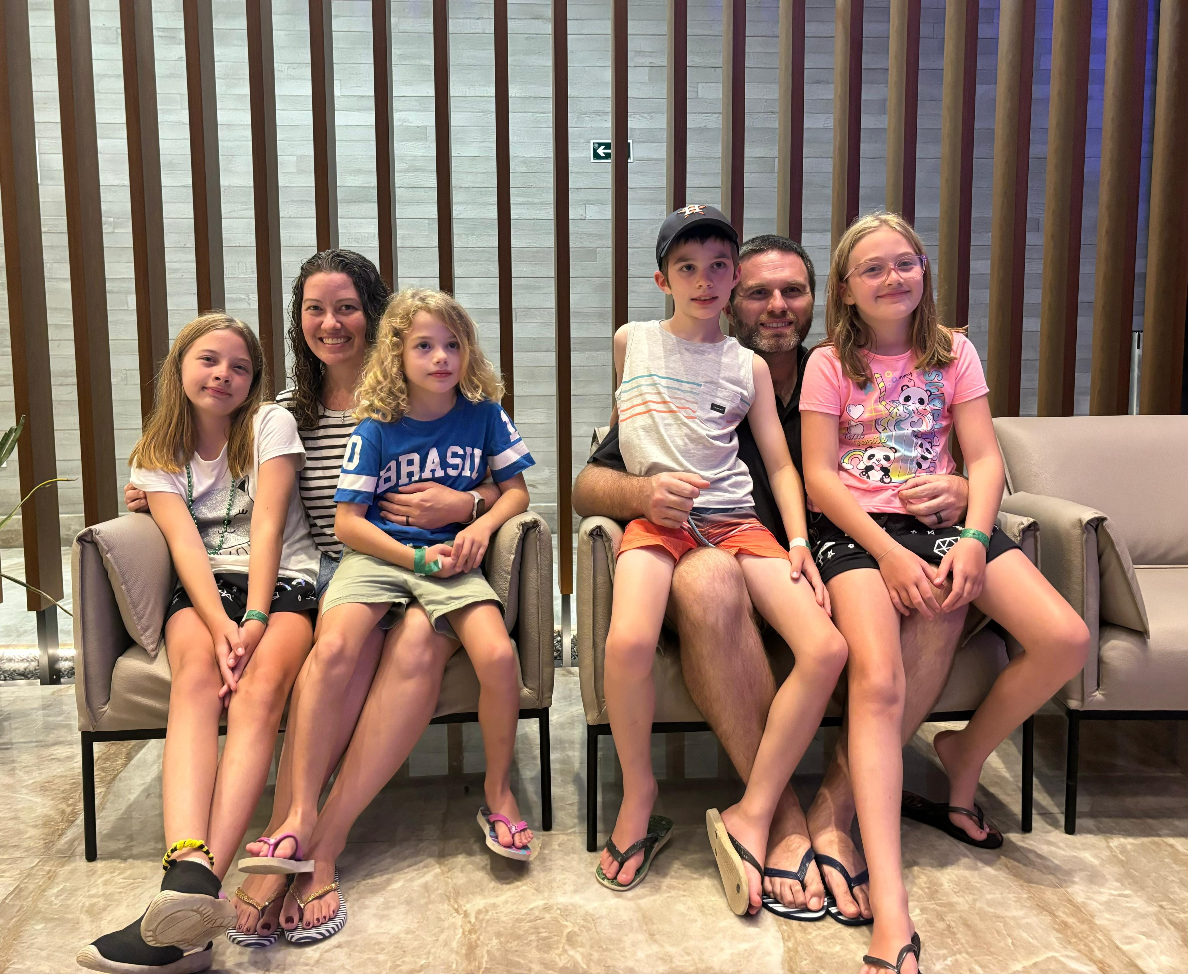
We are settling into the new neighborhood, and our kids have already made one new friends who lives on our street. We are overjoyed at this. This last week Amanda and I also made some world famous cookies (click for recipe), and went around to the neighbors on our street bearing cookies and an invitation to a community breakfast we are hosting this coming Saturday, August 29th. Please pray for good connections, leading to spiritual conversations and relationships with persons of peace.
On a personal health update – this last month has been horrible for Amanda. She has suffered quite a bit with migraines. Please continue to keep this in prayer. Otherwise, our family is doing very well.
Likewise, we are very pleased with the discipleship and evangelism outcomes with our church (more on that below), and with the way ministry in progressing overall. We will be coming back to the states in early spring of next year, and as such, are about to start a fundraising campaign in the lead up to all this.
As always, we are very grateful for your prayers, your calls and text, you financial support, and your love. We couldn’t do this without you!
With Love,
A Familia Blaylock
Donations:
If you would like to donate to the ministry you can do so through through the mission’s secure giving portal here:
Donate Here
Prayer Request:
-
Amanda’s Migraine Struggles
-
Fundraising Efforts
-
Continued Growth of Our Disciples
Quality Time vs Quantity Time
First maybe a quick aside. I always struggle a bit with how much and what to include when it comes to specific stories because we want to respect our people’s lives and privacy with what goes out into the wider public domain. So we lean into being a bit more circumspect. That said, if you ever want more specific information we can have a conversation.
For all the emphasis placed on quality time – be it with a spouse, kids, friends, families, or disciples – one thing is for certain. Quality time cannot be manufactured and it doesn’t (usually) arrive on your schedule. It tends to arrive spontaneously, unexpectedly, as a gift of grace. I think this basic fact shows up especially in the gospels. Most of Jesus’s important parables, miracles, and teaching moments came about less at specific times “to do ministry” (such as at the synagogue), and more as they were on the road together, or on their way from one event to another, or even trying to go about some otherwise unrelated task. Jesus allows himself to be radically open to events as they unfold and he was interruptible – able to set aside his plan as he noticed what His Father was doing in the moment in the life of someone who happened to be in the vicinity.
He seemed to opted for quantity time with his closest friends and disciples, and that created karios moments of brilliance, illustration, ministry, and profound care.
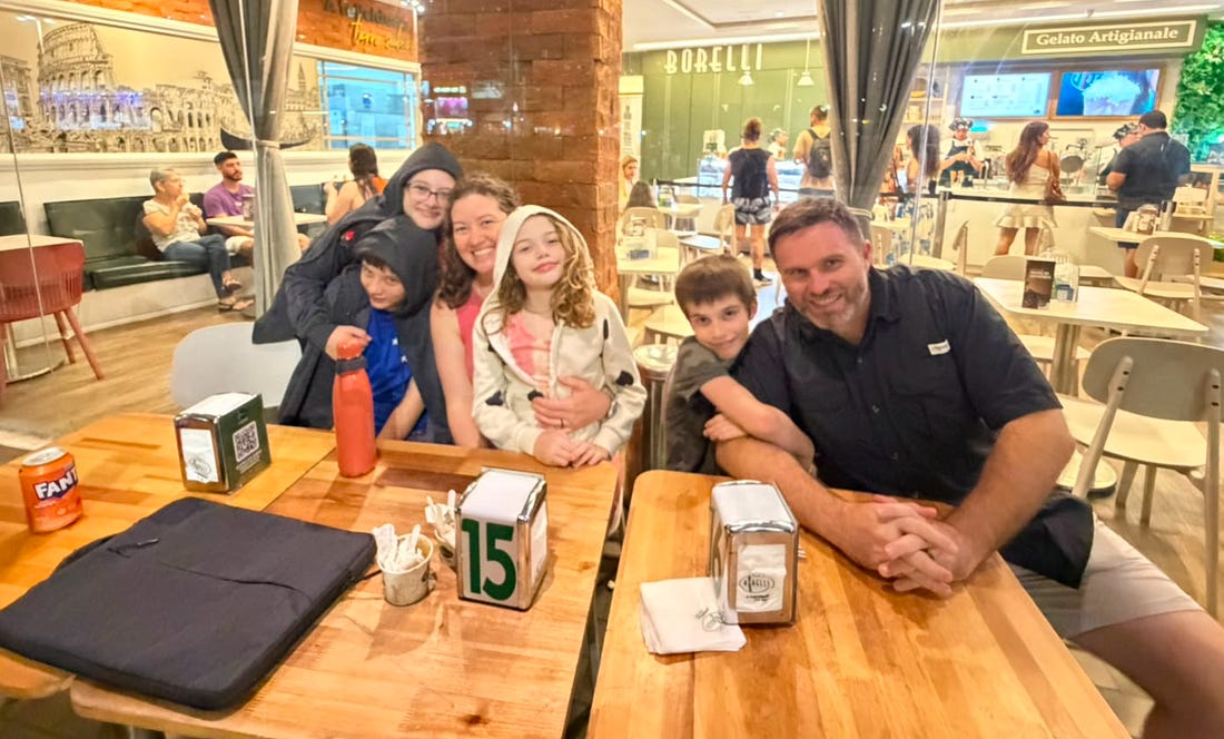
We have certainly been finding this to be true. As we have been able to move away from the craziness of bureaucracy and administration we have been able to more invest in quantity time with our people and it really is leading to some amazing discipleship outcomes. And ice cream outing turns into a time for some deep soul care, a boxing sparing session turns into a chance to discuss the scriptures deeply and some training on intercession, openness and willingness to be interrupted turns training into a time of prophetic evangelism. A trip to the store with your kid allows them to ask the deep questions they have been wrestling with.
And then, the wonderful stream of messages and calls with out people as they are taking these experiences and then sharing their faith with colleagues, asking for bibles to give to new believers, asking for deeper studies in the Word, getting coaching and feedback on prophetic words and dreams, and being active in benevolence due to an imagination for it.
Its quite fun, and very encouraging. It does take discipline to be interruptible, and a posture of open-handedness with your time and attention. But that can be cultivated.
All that to say, take some folks with you as you go “along your way” and recive the quality time as a gift when it arrives.
Until Next Time!
© 2026 Derek Blaylock
Xingu Mission USA, PO Box 340785, Columbus, Ohio 43234
Unsubscribe
 
|
|