Blaylock Missions – Easter Edition @media (max-width: 1024px) { .typography .pullquote-align-left, .typography.editor .pullquote-align-left, .typography .pullquote-align-right, .typography.editor .pullquote-align-right, .typography .pullquote-align-wide, .typography.editor .pullquote-align-wide, .typography .pullquote-align-center, .typography.editor .pullquote-align-center { float: none; margin: 0 auto; width: 100%; max-width: 100%; } } @media all and (-ms-high-contrast: none), (-ms-high-contrast: active) { .typography .markup table.image-wrapper img, .typography.editor .markup table.image-wrapper img, .typography .markup table.kindle-wrapper img, .typography.editor .markup table.kindle-wrapper img { max-width: 550px; } } @media (min-width: 1024px) { .typography:not(:has(#toc)) .captioned-image-container figure:has(> a.image2-offset-left), .typography.editor:not(:has(#toc)) .captioned-image-container figure:has(> a.image2-offset-left) { margin-left: var(–image-offset-margin); } .typography:not(:has(#toc)) .captioned-image-container figure:has(> a.image2-offset-right), .typography.editor:not(:has(#toc)) .captioned-image-container figure:has(> a.image2-offset-right) { margin-right: var(–image-offset-margin); } } @media (min-width: 1300px) { .typography .captioned-image-container figure:has(> a.image2-offset-left), .typography.editor .captioned-image-container figure:has(> a.image2-offset-left) { margin-left: var(–image-offset-margin); } .typography .captioned-image-container figure:has(> a.image2-offset-right), .typography.editor .captioned-image-container figure:has(> a.image2-offset-right) { margin-right: var(–image-offset-margin); } } @media (max-width: 1024px) { .typography, .typography.editor { } .typography .captioned-image-container figure:has(> a.image2-align-left), .typography.editor .captioned-image-container figure:has(> a.image2-align-left), .typography .captioned-image-container figure:has(> a.image2-align-right), .typography.editor .captioned-image-container figure:has(> a.image2-align-right) { float: none; margin: 1em auto; max-width: 100%; width: auto; padding: 0; } .typography .captioned-image-container figure:has(> a.image2-align-left.thefp), .typography.editor .captioned-image-container figure:has(> a.image2-align-left.thefp), .typography .captioned-image-container figure:has(> a.image2-align-right.thefp), .typography.editor .captioned-image-container figure:has(> a.image2-align-right.thefp) { margin: 1em auto; } .typography .captioned-image-container figure:has(> a.image2-offset-left), .typography.editor .captioned-image-container figure:has(> a.image2-offset-left), .typography .captioned-image-container figure:has(> a.image2-offset-right), .typography.editor .captioned-image-container figure:has(> a.image2-offset-right) { margin: 1em auto; } .typography .captioned-image-container figure:has(> a.image2-align-left) .image2-inset, .typography.editor .captioned-image-container figure:has(> a.image2-align-left) .image2-inset, .typography .captioned-image-container figure:has(> a.image2-align-right) .image2-inset, .typography.editor .captioned-image-container figure:has(> a.image2-align-right) .image2-inset { display: block; justify-content: initial; } } @media (max-width: 768px) { .typography .markup div.sponsorship-campaign-embed, .typography.editor .markup div.sponsorship-campaign-embed { margin-top: 24px; margin-bottom: 24px; } .typography .markup div.sponsorship-campaign-embed:first-child, .typography.editor .markup div.sponsorship-campaign-embed:first-child { margin-top: 0px; } } @media screen and (max-width: 650px) { .typography .markup div.youtube-overlay, .typography.editor .markup div.youtube-overlay, .typography .markup div.vimeo-overlay, .typography.editor .markup div.vimeo-overlay { display: none !important; } } @media screen and (max-width: 370px) { .typography .markup div.tiktok-wrap, .typography.editor .markup div.tiktok-wrap { width: calc(95vw – 32px); height: calc((95vw – 32px – 2px) / 0.485714); } } @media screen and (max-width: 650px) { .typography .markup div.embedded-publication-wrap .embedded-publication.show-subscribe, .typography.editor .markup div.embedded-publication-wrap .embedded-publication.show-subscribe { padding: 24px; } } @media screen and (max-width: 650px) { .typography .markup div.subscription-widget-wrap .subscription-widget.show-subscribe, .typography.editor .markup div.subscription-widget-wrap .subscription-widget.show-subscribe, .typography .markup div.subscription-widget-wrap-editor .subscription-widget.show-subscribe, .typography.editor .markup div.subscription-widget-wrap-editor .subscription-widget.show-subscribe, .typography .markup div.captioned-button-wrap .subscription-widget.show-subscribe, .typography.editor .markup div.captioned-button-wrap .subscription-widget.show-subscribe { padding: 0px 24px; } } @media screen and (max-width: 650px) { .typography .markup div.subscription-widget-wrap .subscription-widget.show-subscribe .subscription-widget-subscribe .button, .typography.editor .markup div.subscription-widget-wrap .subscription-widget.show-subscribe .subscription-widget-subscribe .button, .typography .markup div.subscription-widget-wrap-editor .subscription-widget.show-subscribe .subscription-widget-subscribe .button, .typography.editor .markup div.subscription-widget-wrap-editor .subscription-widget.show-subscribe .subscription-widget-subscribe .button, .typography .markup div.captioned-button-wrap .subscription-widget.show-subscribe .subscription-widget-subscribe .button, .typography.editor .markup div.captioned-button-wrap .subscription-widget.show-subscribe .subscription-widget-subscribe .button { padding: 10px 12px; min-width: 110px; } } @media (max-width: 650px) { .typography .markup .twitter-embed, .typography.editor .markup .twitter-embed, .typography .markup .tweet, .typography.editor .markup .tweet { padding: 12px; } } @media (max-width: 650px) { .typography .markup .twitter-embed .tweet-text, .typography.editor .markup .twitter-embed .tweet-text, .typography .markup .tweet .tweet-text, .typography.editor .markup .tweet .tweet-text { font-size: 14px; line-height: 20px; } } @media (max-width: 650px) { .typography .markup .twitter-embed .tweet-photos-container.two, .typography.editor .markup .twitter-embed .tweet-photos-container.two, .typography .markup .tweet .tweet-photos-container.two, .typography.editor .markup .tweet .tweet-photos-container.two, .typography .markup .twitter-embed .tweet-photos-container.three, .typography.editor .markup .twitter-embed .tweet-photos-container.three, .typography .markup .tweet .tweet-photos-container.three, .typography.editor .markup .tweet .tweet-photos-container.three, .typography .markup .twitter-embed .tweet-photos-container.four, .typography.editor .markup .twitter-embed .tweet-photos-container.four, .typography .markup .tweet .tweet-photos-container.four, .typography.editor .markup .tweet .tweet-photos-container.four { height: 200px; } } @media (max-width: 650px) { .typography .markup .twitter-embed a.expanded-link .expanded-link-img, .typography.editor .markup .twitter-embed a.expanded-link .expanded-link-img, .typography .markup .tweet a.expanded-link .expanded-link-img, .typography.editor .markup .tweet a.expanded-link .expanded-link-img { max-height: 180px; } } @media (max-width: 650px) { .typography .markup .twitter-embed a.expanded-link .expanded-link-description, .typography.editor .markup .twitter-embed a.expanded-link .expanded-link-description, .typography .markup .tweet a.expanded-link .expanded-link-description, .typography.editor .markup .tweet a.expanded-link .expanded-link-description { display: none; } } @media screen and (max-width: 650px) { .typography .markup .apple-podcast-container, .typography.editor .markup .apple-podcast-container { width: unset; } } @media (max-width: 420px) { .typography .markup .install-substack-app-embed img.install-substack-app-embed-img, .typography.editor .markup .install-substack-app-embed img.install-substack-app-embed-img { margin: 0 auto 16px auto; } } @media (max-width: 420px) { .typography .markup .install-substack-app-embed .install-substack-app-embed-text, .typography.editor .markup .install-substack-app-embed .install-substack-app-embed-text { margin: 0 0 12px 0; max-width: 100%; width: auto; text-align: center; } } @media (max-width: 420px) { .typography .markup .install-substack-app-embed .install-substack-app-embed-link, .typography.editor .markup .install-substack-app-embed .install-substack-app-embed-link { display: flex; justify-content: center; } } @media screen and (min-width: 481px) { .share-button-container { height: 38px; } } @media screen and (min-width: 481px) { .share-button-container a.comment { height: 38px; line-height: 38px; padding-right: 10px; } } @media screen and (max-width: 480px) { .share-button-container .separator { display: block; margin: 0; height: 8px; border-left: none; } } @media screen and (max-width: 480px) { .share-button-container a.share.first img { padding-left: 0; } } @media screen and (min-width: 481px) { .share-button-container a.mobile { display: none !important; } } @media screen and (min-width: 541px) { .settings-add-pub-modal-wrapper .container .add-recommending-pub-modal-container { padding: 36px; height: 680px; } } @media screen and (min-width: 541px) { .settings-add-pub-modal-wrapper .container .add-recommending-pub-modal-container .footer { position: absolute; bottom: 36px; margin: 0px; } } @media screen and (max-width: 650px) { .header-anchor-parent { display: none; } } @media screen and (max-width: 768px) { .post { padding: 16px 0 0 0; } } @media screen and (max-width: 650px) { .post .post-header .post-label { margin-top: 8px; } } @media screen and (max-width: 650px) { .post .post-header .meta-author-wrap.alternative-meta .meta-right-column .post-meta { margin-top: 6px; } } @media screen and (max-width: 650px) { .post .footer-facepile-container { height: 64px; padding: 0 16px; display: flex; align-items: center; justify-content: flex-start; width: 100%; } } @media screen and (max-width: 650px) { .post .post-footer.use-separators { justify-content: center; } } @media screen and (max-width: 650px) { .post .post-footer.next-prev { height: 64px; justify-content: space-between; box-sizing: border-box; } } @media screen and (max-width: 650px) { .post-contributor-footer .post-contributor-bio-table { display: block; } .post-contributor-footer .post-contributor-bio-table-row { display: flex; flex-direction: row; } .post-contributor-footer .post-contributor-bio-userhead-cell, .post-contributor-footer .post-contributor-bio-body-cell { display: block; } .post-contributor-footer .post-contributor-bio-body-cell { flex-grow: 1; } .post-contributor-footer .post-contributor-bio-body-table { display: block; } .post-contributor-footer .post-contributor-bio-body-table-row { display: block; } .post-contributor-footer .post-contributor-bio-copy-cell, .post-contributor-footer .post-contributor-bio-controls-cell { display: block; } .post-contributor-footer .post-contributor-bio-copy-cell { margin: 0 0 16px 0; } .post-contributor-footer .post-contributor-bio-controls-cell { width: auto; } .post-contributor-footer .post-contributor-bio-controls { margin: auto; } .post-contributor-footer .post-contributor-bio-controls .button.primary { width: 100%; } .post-contributor-footer .post-contributor-bio-text { font-size: 14px; } } @media screen and (min-width: 768px) { .post-silhouette { padding: 32px 0; } } @media screen and (max-width: 650px) { .post-silhouette .post-silhouette-title { margin-top: 10.44225025px; height: 120px; } } @media screen and (max-width: 650px) { .post-silhouette .post-silhouette-meta { width: 75%; } } @media screen and (max-width: 650px) { .post-silhouette .post-silhouette-meta.with-byline-image { margin: 20px 0; } } @media screen and (max-width: 650px) { .use-theme-bg .post-meta.alternative-meta .post-meta-item, .post-meta.alternative-meta .post-meta-item { padding-right: 16px; } } @media screen and (max-width: 370px) { .use-theme-bg .post-meta.alternative-meta .post-meta-item, .post-meta.alternative-meta .post-meta-item { font-size: 14px; } } @media screen and (max-width: 650px) { .use-theme-bg .post-meta.alternative-meta .post-meta-item.guest-author-publication, .post-meta.alternative-meta .post-meta-item.guest-author-publication { display: none; } } @media screen and (max-width: 370px) { .post-meta .post-meta-item .post-meta-button { height: 36px !important; } .post-meta .post-meta-item .post-meta-button .meta-button-label { display: none; } .post-meta .post-meta-item .post-meta-button > svg { margin-right: 0; } } @media screen and (max-width: 370px) { .post-meta .post-meta-item { font-size: 12px; } } @media screen and (max-width: 650px) { .post .floating-subscribe-button { bottom: 20px; right: 20px; } } @media (max-width: 1024px) { body .pullquote-align-left, body .pullquote-align-right, body .pullquote-align-wide, body .pullquote-align-center { float: none; margin: 0 auto; width: 100%; max-width: 100%; } } @media all and (-ms-high-contrast: none), (-ms-high-contrast: active) { body .markup table.image-wrapper img, body .markup table.kindle-wrapper img { max-width: 550px; } } @media (min-width: 1024px) { body:not(:has(#toc)) .captioned-image-container figure:has(> a.image2-offset-left) { margin-left: var(–image-offset-margin); } body:not(:has(#toc)) .captioned-image-container figure:has(> a.image2-offset-right) { margin-right: var(–image-offset-margin); } } @media (min-width: 1300px) { body .captioned-image-container figure:has(> a.image2-offset-left) { margin-left: var(–image-offset-margin); } body .captioned-image-container figure:has(> a.image2-offset-right) { margin-right: var(–image-offset-margin); } } @media (max-width: 1024px) { body { } body .captioned-image-container figure:has(> a.image2-align-left), body .captioned-image-container figure:has(> a.image2-align-right) { float: none; margin: 1em auto; max-width: 100%; width: auto; padding: 0; } body .captioned-image-container figure:has(> a.image2-align-left.thefp), body .captioned-image-container figure:has(> a.image2-align-right.thefp) { margin: 1em auto; } body .captioned-image-container figure:has(> a.image2-offset-left), body .captioned-image-container figure:has(> a.image2-offset-right) { margin: 1em auto; } body .captioned-image-container figure:has(> a.image2-align-left) .image2-inset, body .captioned-image-container figure:has(> a.image2-align-right) .image2-inset { display: block; justify-content: initial; } } @media (max-width: 768px) { body .markup div.sponsorship-campaign-embed { margin-top: 24px; margin-bottom: 24px; } body .markup div.sponsorship-campaign-embed:first-child { margin-top: 0px; } } @media screen and (max-width: 650px) { body .markup div.youtube-overlay, body .markup div.vimeo-overlay { display: none !important; } } @media screen and (max-width: 370px) { body .markup div.tiktok-wrap { width: calc(95vw – 32px); height: calc((95vw – 32px – 2px) / 0.485714); } } @media screen and (max-width: 650px) { body .markup div.embedded-publication-wrap .embedded-publication.show-subscribe { padding: 24px; } } @media screen and (max-width: 650px) { body .markup div.subscription-widget-wrap .subscription-widget.show-subscribe, body .markup div.subscription-widget-wrap-editor .subscription-widget.show-subscribe, body .markup div.captioned-button-wrap .subscription-widget.show-subscribe { padding: 0px 24px; } } @media screen and (max-width: 650px) { body .markup div.subscription-widget-wrap .subscription-widget.show-subscribe .subscription-widget-subscribe .button, body .markup div.subscription-widget-wrap-editor .subscription-widget.show-subscribe .subscription-widget-subscribe .button, body .markup div.captioned-button-wrap .subscription-widget.show-subscribe .subscription-widget-subscribe .button { padding: 10px 12px; min-width: 110px; } } @media (max-width: 650px) { body .markup .twitter-embed, body .markup .tweet { padding: 12px; } } @media (max-width: 650px) { body .markup .twitter-embed .tweet-text, body .markup .tweet .tweet-text { font-size: 14px; line-height: 20px; } } @media (max-width: 650px) { body .markup .twitter-embed .tweet-photos-container.two, body .markup .tweet .tweet-photos-container.two, body .markup .twitter-embed .tweet-photos-container.three, body .markup .tweet .tweet-photos-container.three, body .markup .twitter-embed .tweet-photos-container.four, body .markup .tweet .tweet-photos-container.four { height: 200px; } } @media (max-width: 650px) { body .markup .twitter-embed a.expanded-link .expanded-link-img, body .markup .tweet a.expanded-link .expanded-link-img { max-height: 180px; } } @media (max-width: 650px) { body .markup .twitter-embed a.expanded-link .expanded-link-description, body .markup .tweet a.expanded-link .expanded-link-description { display: none; } } @media screen and (max-width: 650px) { body .markup .apple-podcast-container { width: unset; } } @media (max-width: 420px) { body .markup .install-substack-app-embed img.install-substack-app-embed-img { margin: 0 auto 16px auto; } } @media (max-width: 420px) { body .markup .install-substack-app-embed .install-substack-app-embed-text { margin: 0 0 12px 0; max-width: 100%; width: auto; text-align: center; } } @media (max-width: 420px) { body .markup .install-substack-app-embed .install-substack-app-embed-link { display: flex; justify-content: center; } } @media screen and (min-width: 500px) { body .header a.logo { width: 42px; height: 42px; border-radius: 12px; } } @media screen and (max-width: 420px) { body .subscription-receipt table:first-of-type .subscription-amount .subscription-discount { width: 72px !important; } } @media screen and (min-width: 481px) { body .share-button-container { height: auto; } } @media screen and (max-width: 480px) { body .share-button-container .separator { display: block !important; margin: 0 !important; height: 8px !important; border-left: none !important; } } @media screen and (max-width: 650px) { .digest .item .post-meta-item.audience { display: none; } } @media screen and (min-width: 500px) { .digest-publication .logo img { width: 42px; height: 42px; border-radius: 8px; } } @media screen and (max-width: 650px) { .comments-page .container .comment-list .collapsed-reply { margin-left: calc(10 + 32px – 24px); } } @media screen and (max-width: 650px) { .comment > .comment-list { padding-left: 24px; } } @media screen and (max-width: 650px) { .finish-magic-login-modal .modal-content .container { padding: 24px 0; } } @media (max-width: 650px) { .reader2-text-b3 { line-height: 24px; } } @media screen and (max-width: 650px) { .reader2-text-h4 { line-height: 24px; } } @media screen and (min-width: 541px) { .user-profile-modal { padding-left: 12px; padding-right: 12px; } } @media screen and (max-width: 650px) { .subscribe-widget form.form .sideBySideWrap button.rightButton { padding: 10px 12px; } } @media screen and (min-width: 541px) { .pub-icon:hover .logo-hover, .feed-item-icon:hover .logo-hover { display: block; } } @media screen and (max-width: 650px) { .post-ufi.single-full-width-button .post-ufi-button-wrapper { width: 100%; padding: 16px; } .post-ufi.single-full-width-button .post-ufi-button-wrapper:empty { display: none; } .post-ufi.single-full-width-button .post-ufi-button { width: 100%; justify-content: center; } } @media screen and (max-width: 768px) { .file-embed-wrapper { padding: 0; } } @media screen and (max-width: 768px) { .file-embed-wrapper-editor { padding: 0; } } @media screen and (max-width: 768px) { .file-embed-wrapper-editor:active { padding: 0; } } @media only screen and (max-width: 650px) { .file-embed-button.wide, .file-embed-error-button.wide { display: none; } } @media only screen and (min-width: 630px) { .file-embed-button.narrow, .file-embed-error-button.narrow { display: none; } } @media screen and (min-width: 541px) { .audio-player-wrapper .audio-player { min-width: 500px; } } @media screen and (max-width: 650px) { .audio-player-wrapper .audio-player .audio-player-progress { border-left-width: 16px; border-right-width: 16px; } } @media screen and (max-width: 650px) { .audio-player-wrapper .audio-player .audio-player-progress .audio-player-progress-bar .audio-player-progress-bar-popup { top: -54px; } } @media screen and (max-width: 650px) { .audio-player-wrapper-fancy .audio-player .audio-player-progress { border-left-width: 16px; border-right-width: 16px; } } @media screen and (max-width: 650px) { .audio-player-wrapper-fancy .audio-player .audio-player-progress .audio-player-progress-bar .audio-player-progress-bar-popup { top: -54px; } } @media (min-width: 250px) { .audio-player-wrapper-fancy .audio-player { padding: 32px; } .audio-player-wrapper-fancy .audio-player .btn-group { display: flex; } .audio-player-wrapper-fancy .audio-player .btn-group .button:last-of-type { display: block; } } @media (min-width: 300px) { .audio-player-wrapper-fancy .audio-player .btn-group { display: block; } .audio-player-wrapper-fancy .audio-player .btn-group .button:first-of-type { display: block; } } @media (min-width: 350px) { .audio-player-wrapper-fancy .audio-player .audio-player-substack-logo { display: block; } .audio-player-wrapper-fancy .audio-player .audio-player-title { margin-top: 16px; } .audio-player-wrapper-fancy .audio-player .audio-player-hero-image-container { padding-top: 15%; width: 15%; display: block; } .audio-player-wrapper-fancy .audio-player .btn-group .button:first-of-type { display: block; } .audio-player-wrapper-fancy .audio-player .audio-player-substack-logo { display: block; } } @media (min-width: 350px) { .audio-player-wrapper-fancy .audio-player .audio-player-hero-image-container { padding-top: 25%; width: 25%; display: block; } .audio-player-wrapper-fancy .audio-player .btn-group { display: flex; } .audio-player-wrapper-fancy .audio-player .btn-group .button:first-of-type { display: block; } } @media (min-width: 400px) { .audio-player-wrapper-fancy .audio-player .audio-player-hero-image-container { padding-top: 40%; width: 40%; } } @media (max-width: 400px) { .audio-player-wrapper-fancy .audio-player .btn-group { margin-top: 12px; } .audio-player-wrapper-fancy .audio-player .btn-group .button { font-size: 13px; padding: 6px 12px; height: auto; margin-top: 10px; } } @media (min-width: 600px) { .audio-player-wrapper-fancy .audio-player .audio-player-hero-image-container { padding-top: 55%; width: 55%; } } @media (max-width: 650px) { .poll-editor-modal { min-width: calc(100% – 20px); } } @media (max-width: 750px) { .poll-embed .poll-anchor-target .poll-anchor-copy-button { left: 8px; top: 45px; } }

Hello Friends,
͏ ͏ ͏ ͏ ͏ ͏ ͏ ͏ ͏ ͏ ͏ ͏ ͏ ͏ ͏ ͏ ͏ ͏ ͏ ͏ ͏ ͏ ͏ ͏ ͏ ͏ ͏ ͏ ͏ ͏ ͏ ͏ ͏ ͏ ͏ ͏ ͏ ͏ ͏ ͏ ͏ ͏ ͏ ͏ ͏ ͏ ͏ ͏ ͏ ͏ ͏ ͏ ͏ ͏ ͏ ͏ ͏ ͏ ͏ ͏ ͏ ͏ ͏ ͏ ͏ ͏ ͏ ͏ ͏ ͏ ͏ ͏ ͏ ͏ ͏ ͏ ͏ ͏ ͏ ͏ ͏ ͏ ͏ ͏ ͏ ͏ ͏ ͏ ͏ ͏ ͏ ͏ ͏ ͏ ͏ ͏ ͏ ͏ ͏ ͏ ͏ ͏ ͏ ͏ ͏ ͏ ͏ ͏ ͏ ͏ ͏ ͏ ͏ ͏ ͏ ͏ ͏ ͏ ͏ ͏ ͏ ͏ ͏ ͏ ͏ ͏ ͏ ͏ ͏ ͏ ͏ ͏ ͏ ͏ ͏ ͏ ͏ ͏ ͏ ͏ ͏ ͏ ͏ ͏ ͏ ͏ ͏ ͏ ͏ ͏ ͏ ͏ ͏ ͏ ͏ ͏ ͏ ͏ ͏ ͏ ͏ ͏ ͏ ͏ ͏ ͏ ͏ ͏ ͏ ͏ ͏ ͏ ͏ ͏ ͏ ͏ ͏ ͏ ͏ ͏ ͏ ͏ ͏ ͏ ͏ ͏ ͏ ͏ ͏ ͏ ͏ ͏ ͏ ͏ ͏ ͏ ͏ ͏ ͏ ͏
|
|
|
|
Missão Xingu: Blaylocks in Brazil
Hello Friends,
Thank you all very much for your prayers on our behalf and on behalf of the churches here in Joao Pessoa. We are grateful for you friendship, support, prayers, and donations.
Please forgive me for the brevity of this update as we are in the busiest month I can recall having since moving here to Brazil. Starting with the next newsletter we will provide some more detailed stories about what is going on here.
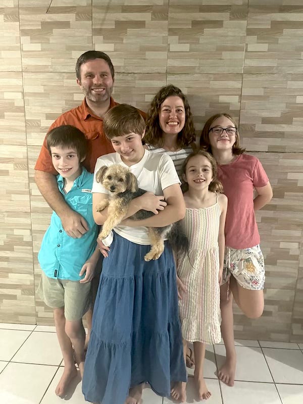
As a quick family update – we are doing very well! We have had better health this month, our marriage and family life is wonderful, the kids are thriving here, and we are enjoying the city and the friends that the Lord has brought us.
The biggest update on this front: We are buying a house! This house was formally owned by pastors and they had hoped another ministry family would be able to move in. We will share more on this when we get settled, but please pray for us as we navigate the issues with buying property in a foreign country and moving a larger sum of money abroad than we are accustomed to. We recieved some prophetic words from some of you, and much encouragament which has enabled us to move forward with this despite the crashing exchange rate due to recent world events. This is a significant step of faith for us, but also feels like planting some roots in the city that we believe the Lord has called us to.
Quick ministry updates below, and our prayer request.
Love you all,
The Blaylocks
Donations:
If you would like to donate to the ministry you can do so through through the mission’s secure giving portal here:
Donate Here
Prayer Request
-
House Purchase – Finances and navigating the bureaucracy.
-
Street Ministry – Continued favor from the recent breakthrough, against spiritual warfare for these ladies, and for salvations.
-
Vineyard Renovar – That we navigate this recent growth spurt and pastor well.
-
Rede Renovar – We have one new potential leaders to start new simple church, as well as having entered into relationship with a different simple church in another of our targeted neighborhoods. Pray for wisdom, leadership training, and growth in the network.
-
For the work we are doing with the School of Sustainable Faith in trying to establish Portugese speaking pastoral care cohorts.
We have some wonderful friends, partners in ministry, and fellow Vineyardist here in Jen and Phillip Snell. The have a ministry here called Hope Ministries which is meant to combat sex trafficking and help women leave prostitution – providing first contact and prayer ministry at the street, initial steps in salvation and discpleship, social assistance, and job training. Our family has the privilege of working under thier direction in these endavors. Likewise, they work alongside us in the establishment of simple churches, and the simple church network here.
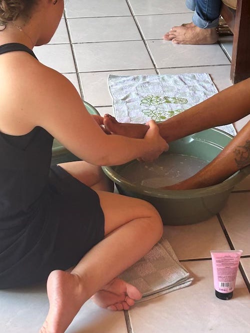
Recently there was a retreat for some of the ladies that have left the street or are in process. The goal of the retreat was for the women to feel loved and cherished, hear testimonies of deliverance, eat some good food, got some pampering along with being able to meditate on scriptures, and finally went through a ceremony of nailing thier burdens to the cross. It was a powerful moment for these dear ladies and for Amanda who got to serve there.
Likewise, this past week we were down on the street doing prayer ministry at one of the two common areas. There are some “cabarets” in these areas that serve as a primary meeting hub, and this past week one of the prayer teams was able to gain entrance to this place for the first time in many years. They were allowed to do prayer ministry with some of the ladies there, and received an invitation to come back next week! It was a major breakthrough! Please pray for this ministry that many more will come to know the love of Christ and experience freedom.
We also celebrated our first Easter at Vineyard Renovar! It was a joyous time with our budding church community which has grown quite a bit since January of this year. We are navigating how to deeply connect with those who are new here, attend to the pastoral needs and soul care, help people along their discipleship journey, and work with those who have the potential to start other simple churches in their context. We are excited to continue to see what God is going to do with this, and are grateful for the opportunity to minister here.
And finally, this month I (Derek) have three cohorts, 2-day cohorts with the School of Sustainable Faith where I serve as an apprentice and supervisor in the training of spiritual direction. Normally, I only have a single, 2-day cohort every 8 to 10 weeks, but a confluence of events lead to this month being particularly full! The trainings are going well, are students are developing into fine spiritual directors, and I am also growing as a director, supervisor, and teacher. Two of the cohorts will be graduated off after this month and I will be able to return to a more normal pace with this.
Until next month!
The Blaylock
© 2026 Derek Blaylock
Xingu Mission USA, PO Box 340785, Columbus, Ohio 43234
Unsubscribe
 
|
|

